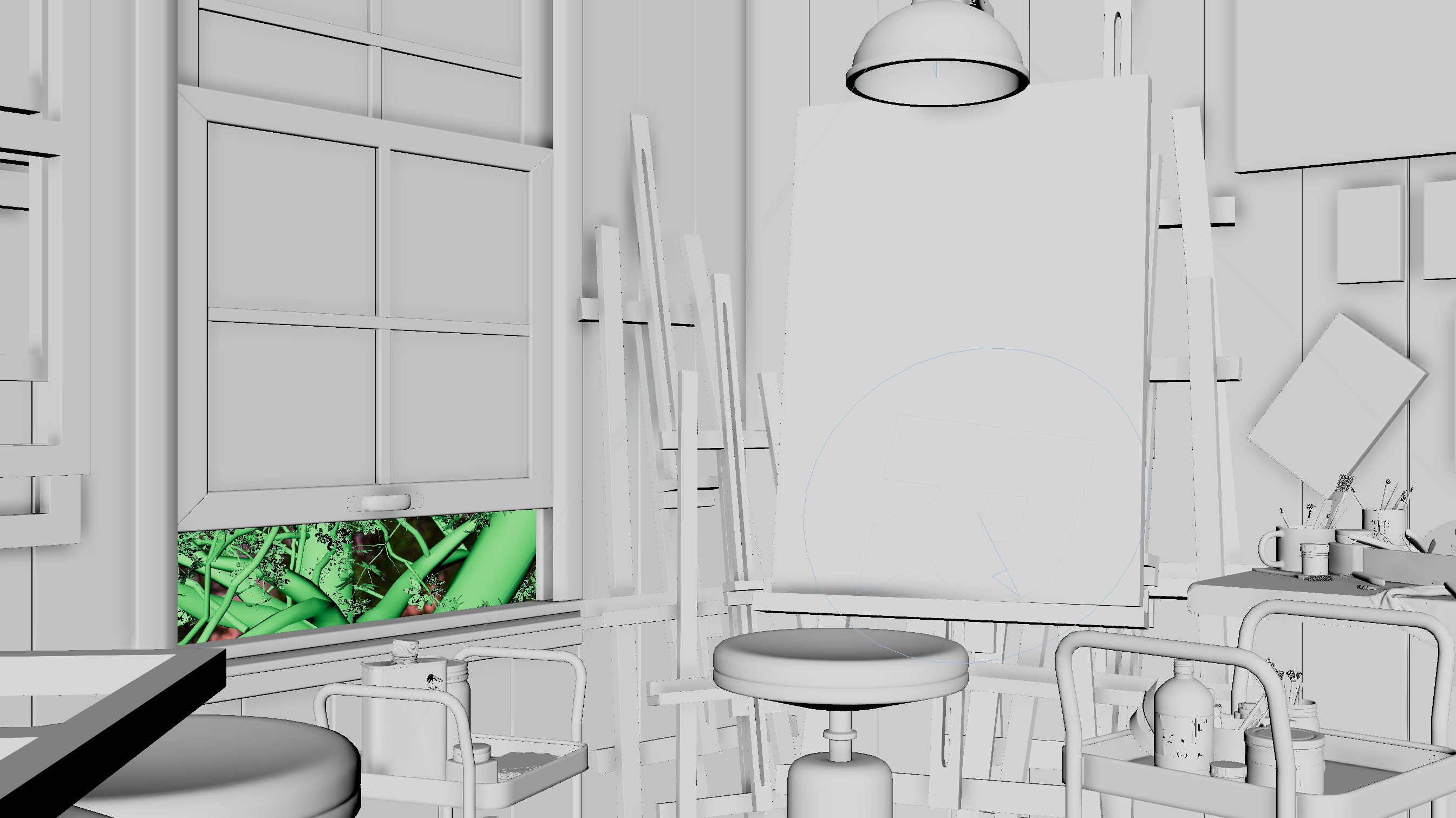
I built the layout from storyboards, with each one highlighting a different aspect of the room and exploring the space. I wanted the audience to be able to gain an understanding of Cassandra from the way each shot was set dressed as well as get a full feel for the room by the end of the short.
You can view the shot breakdown below by clicking on the tabs.
Storyboard
.png)
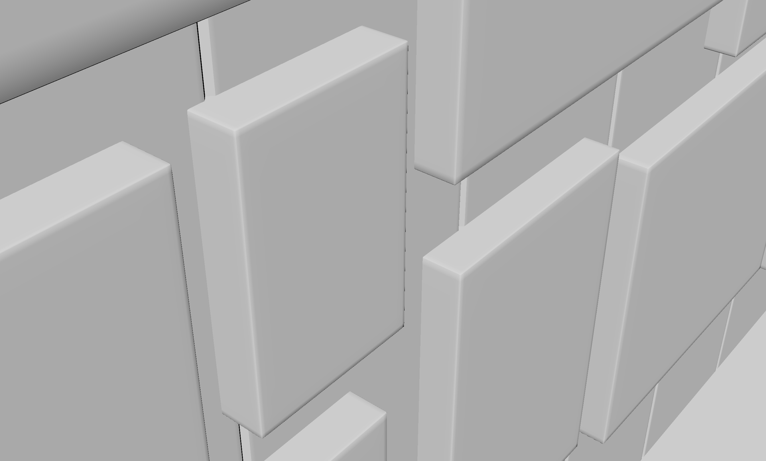
Layout
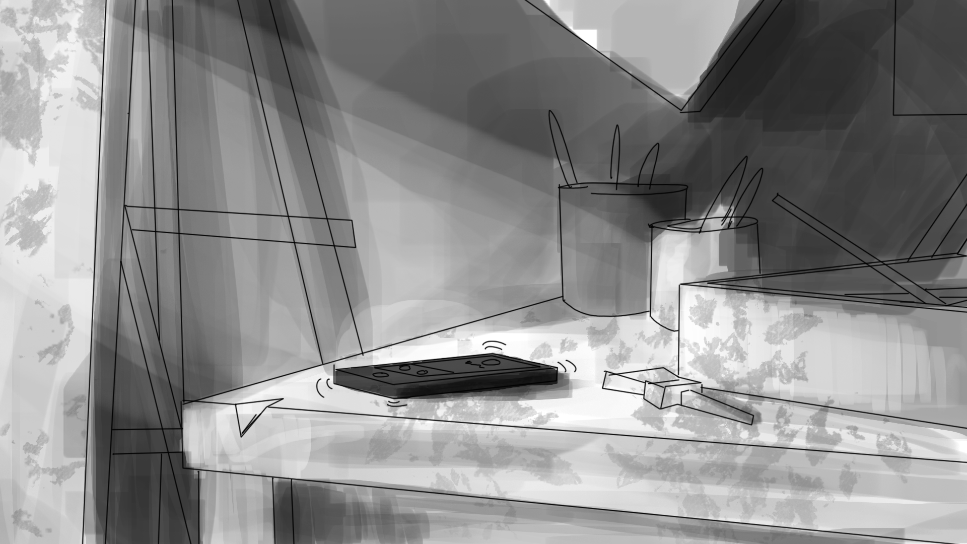
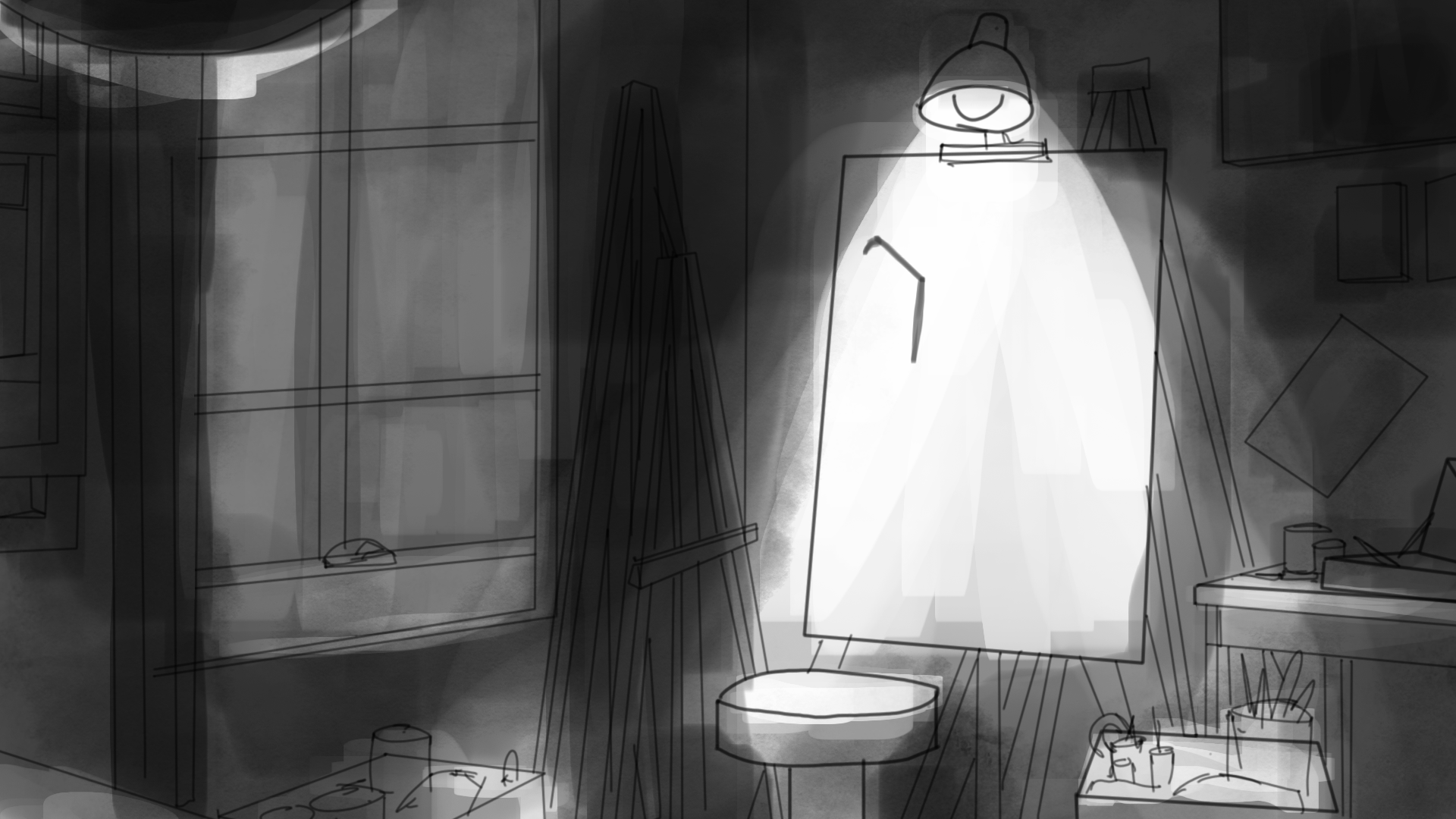
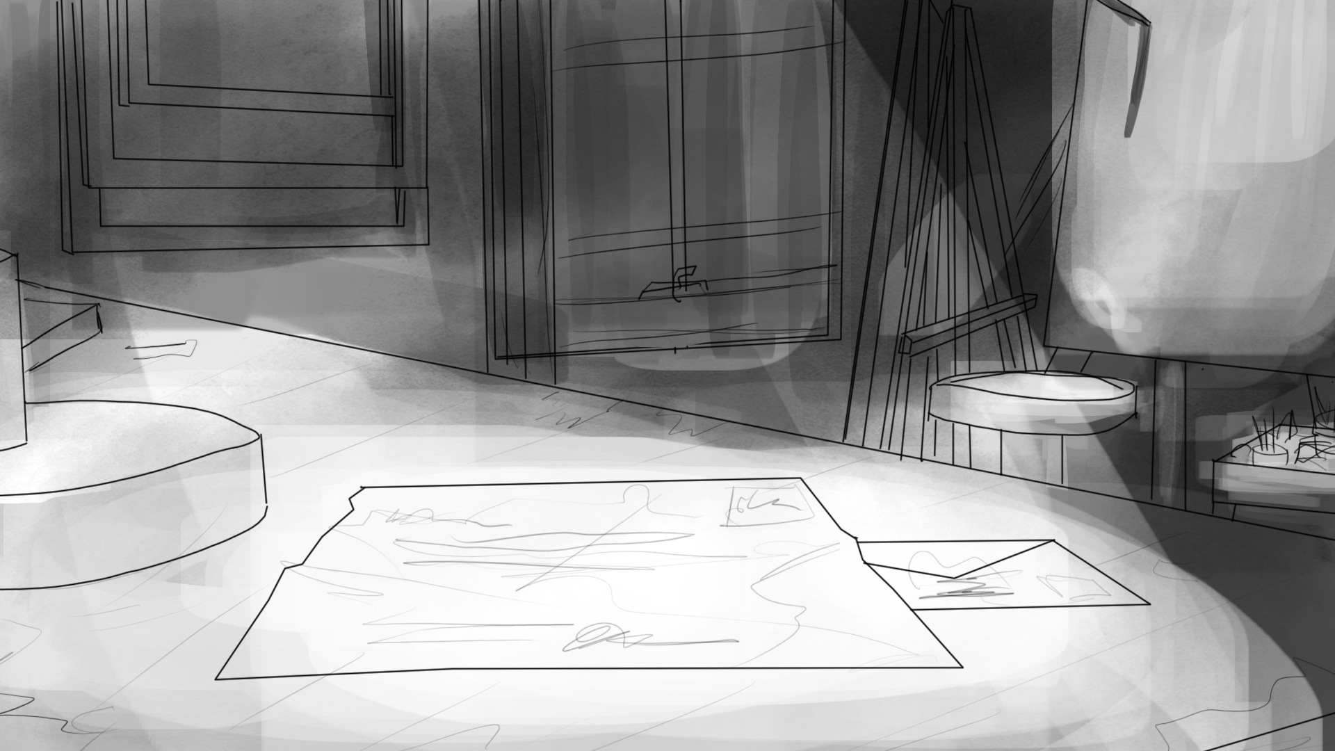
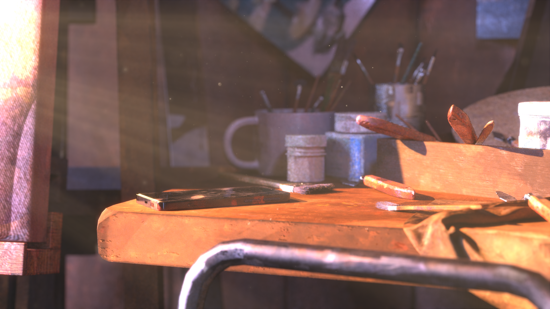
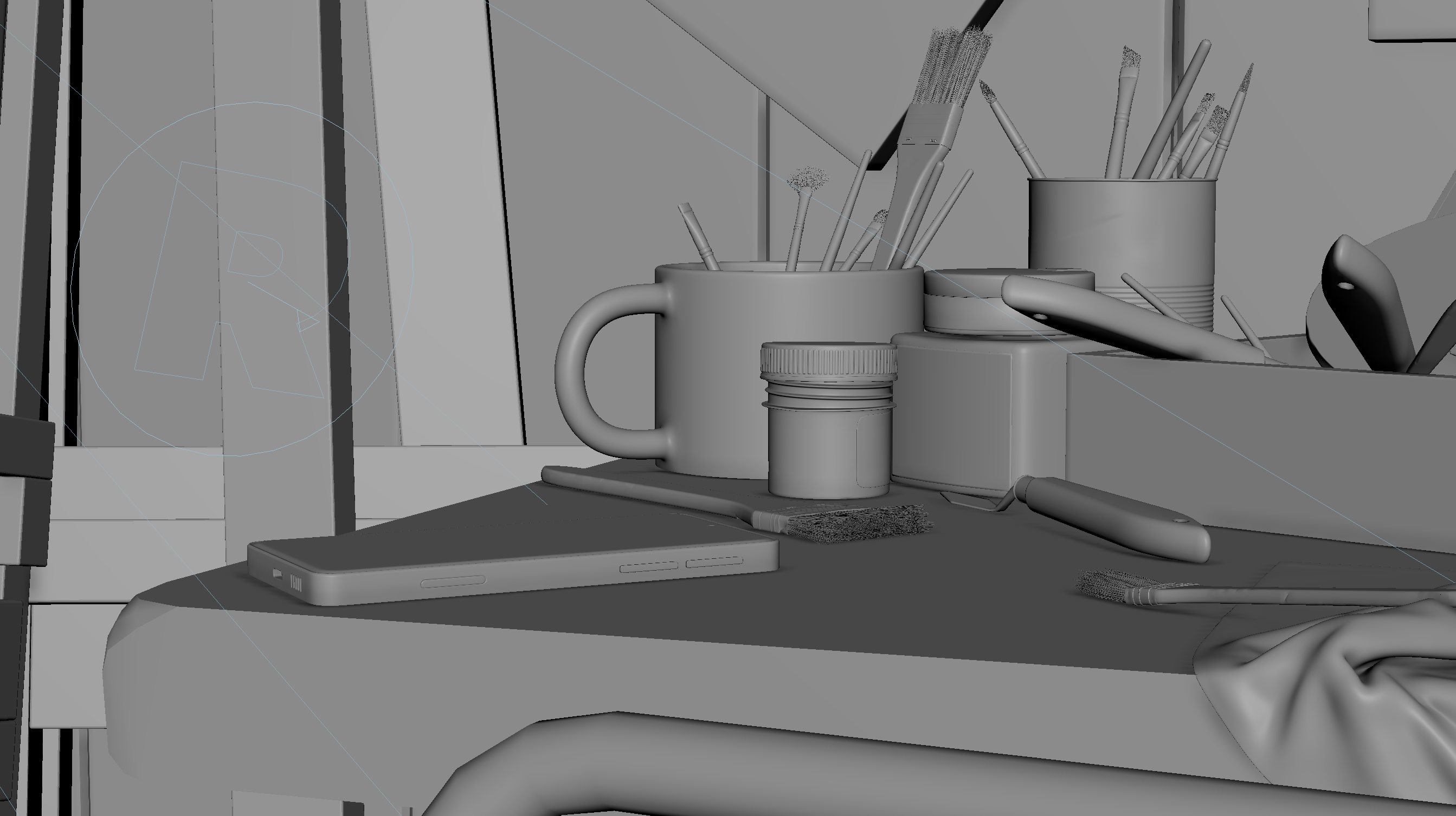
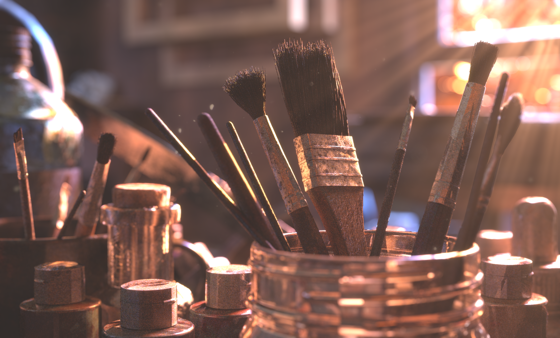
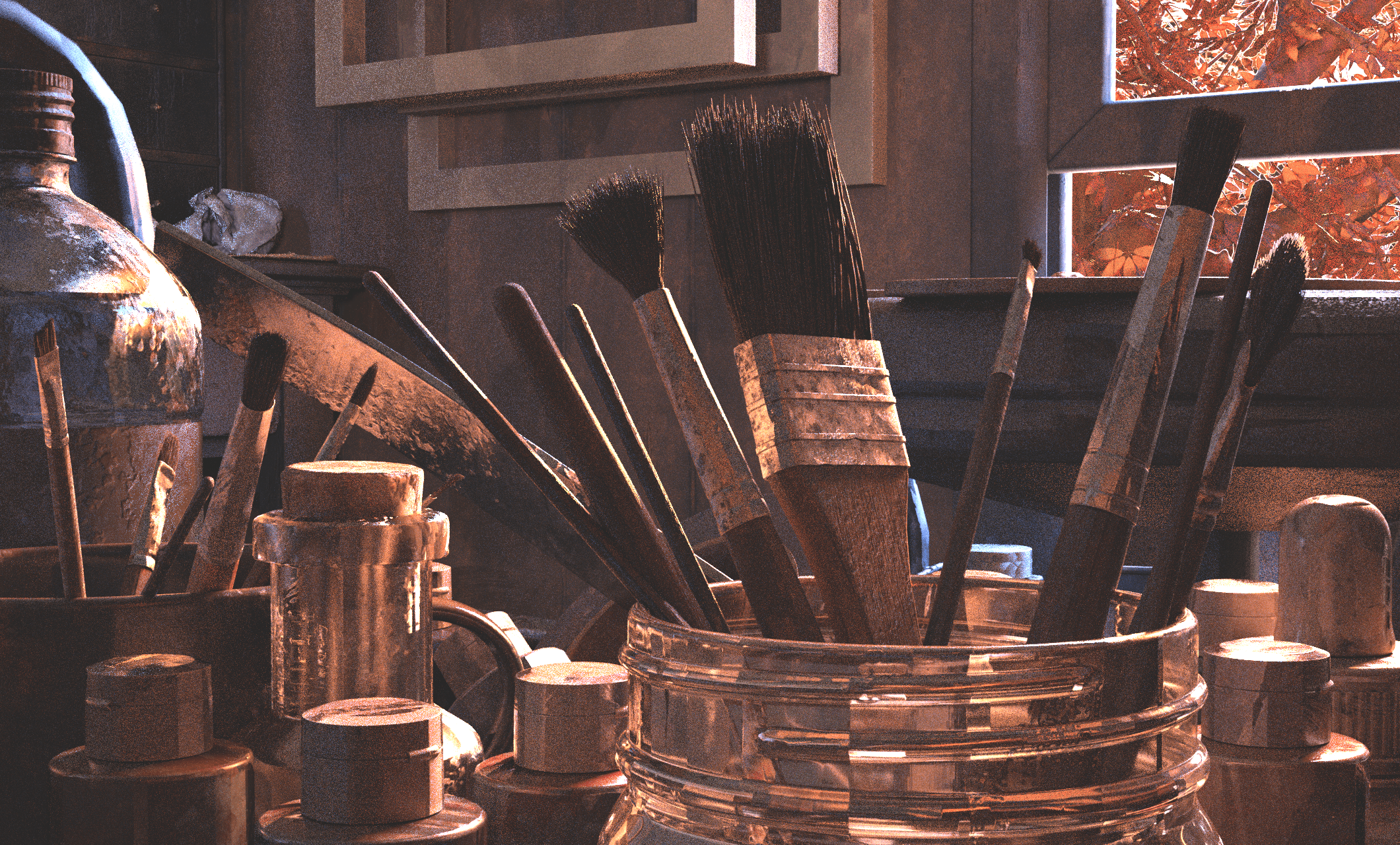
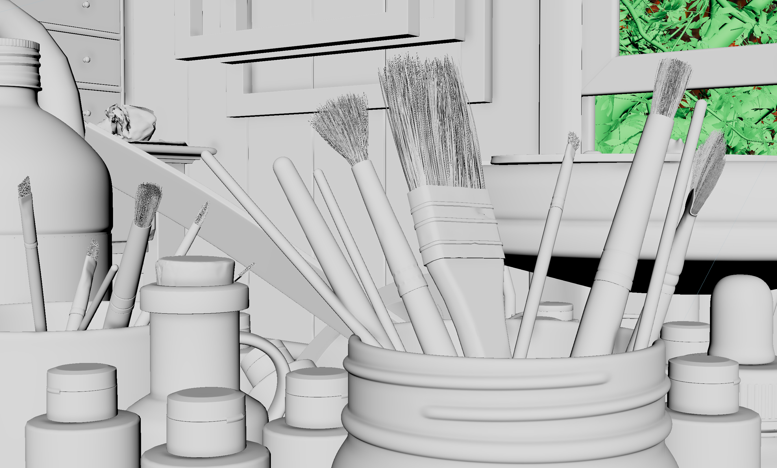
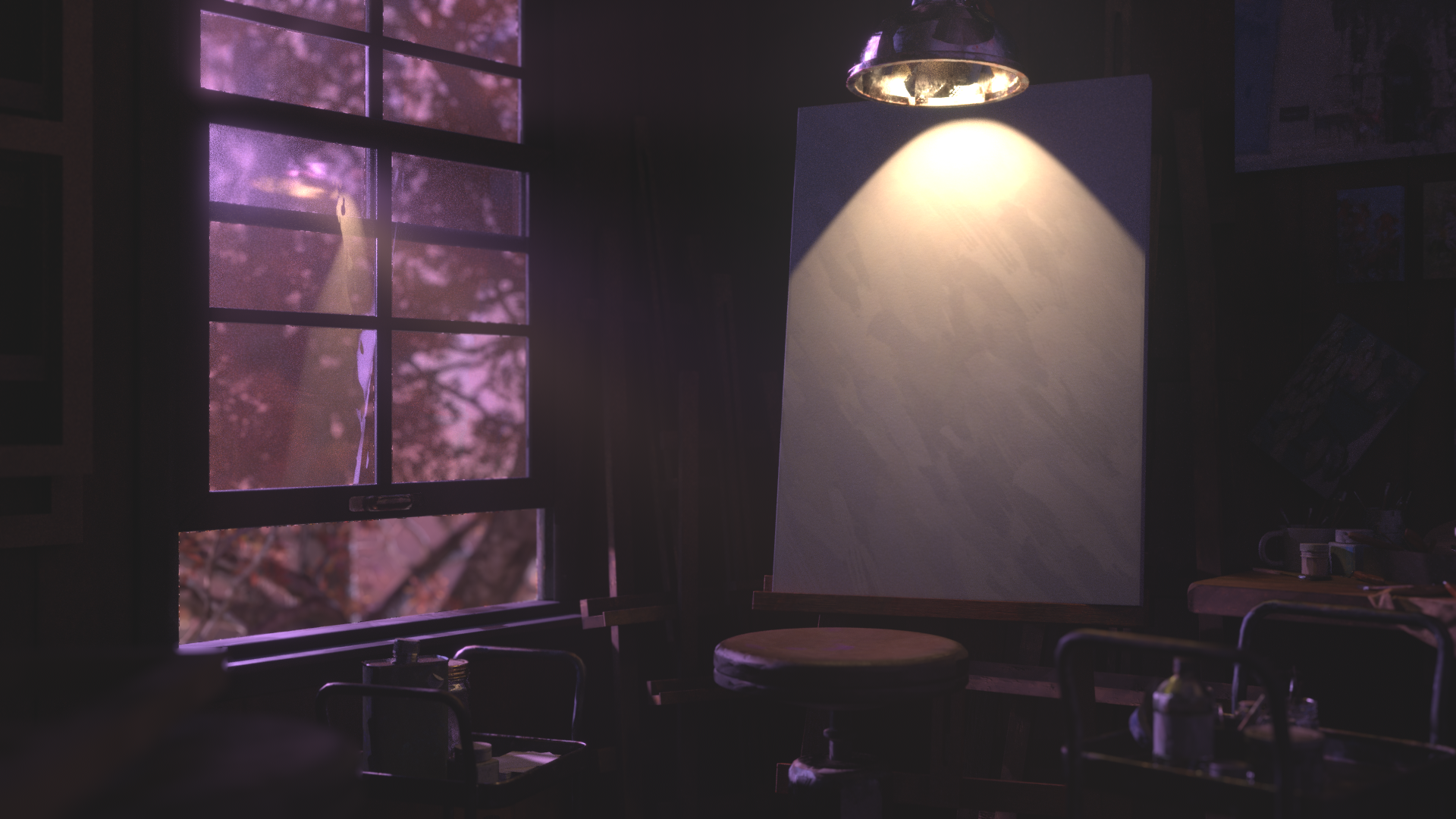
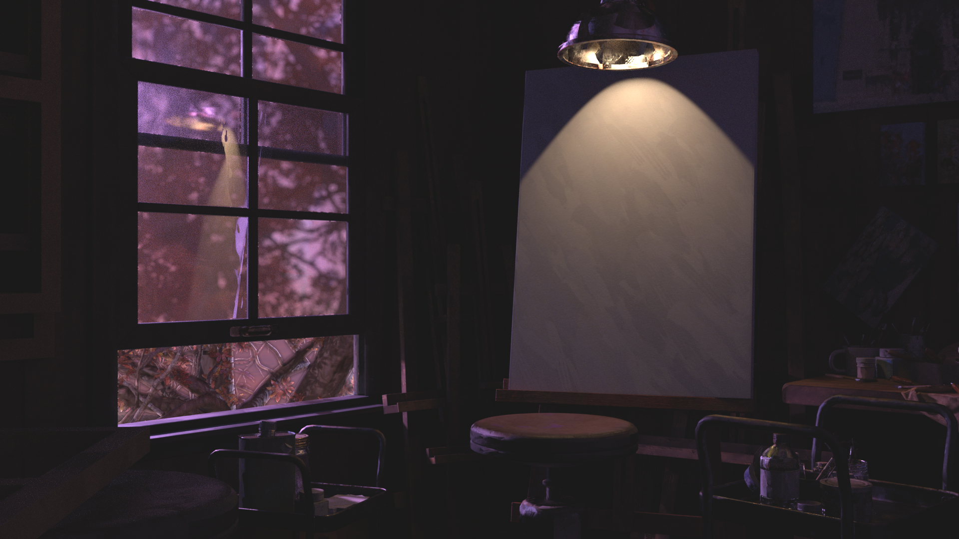
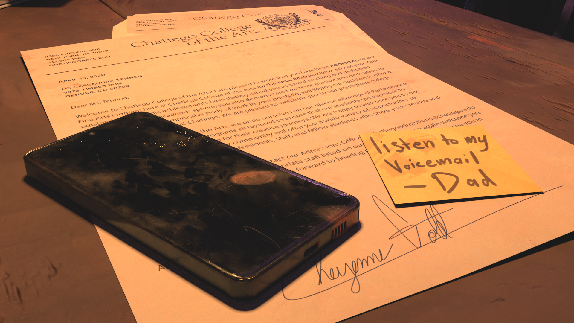
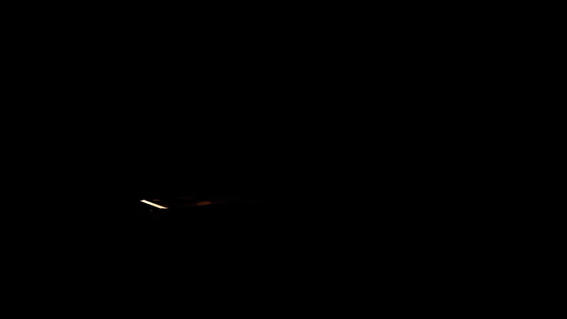
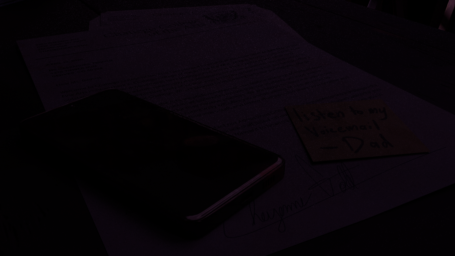
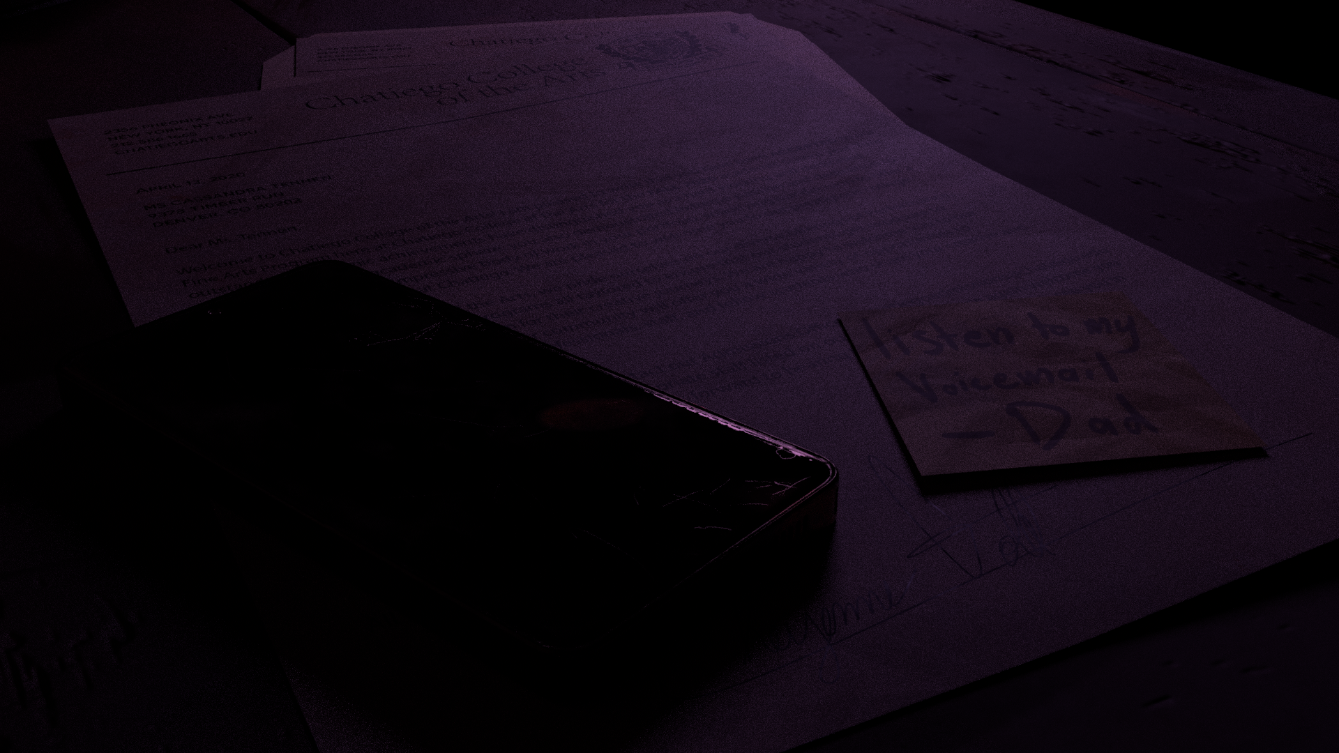
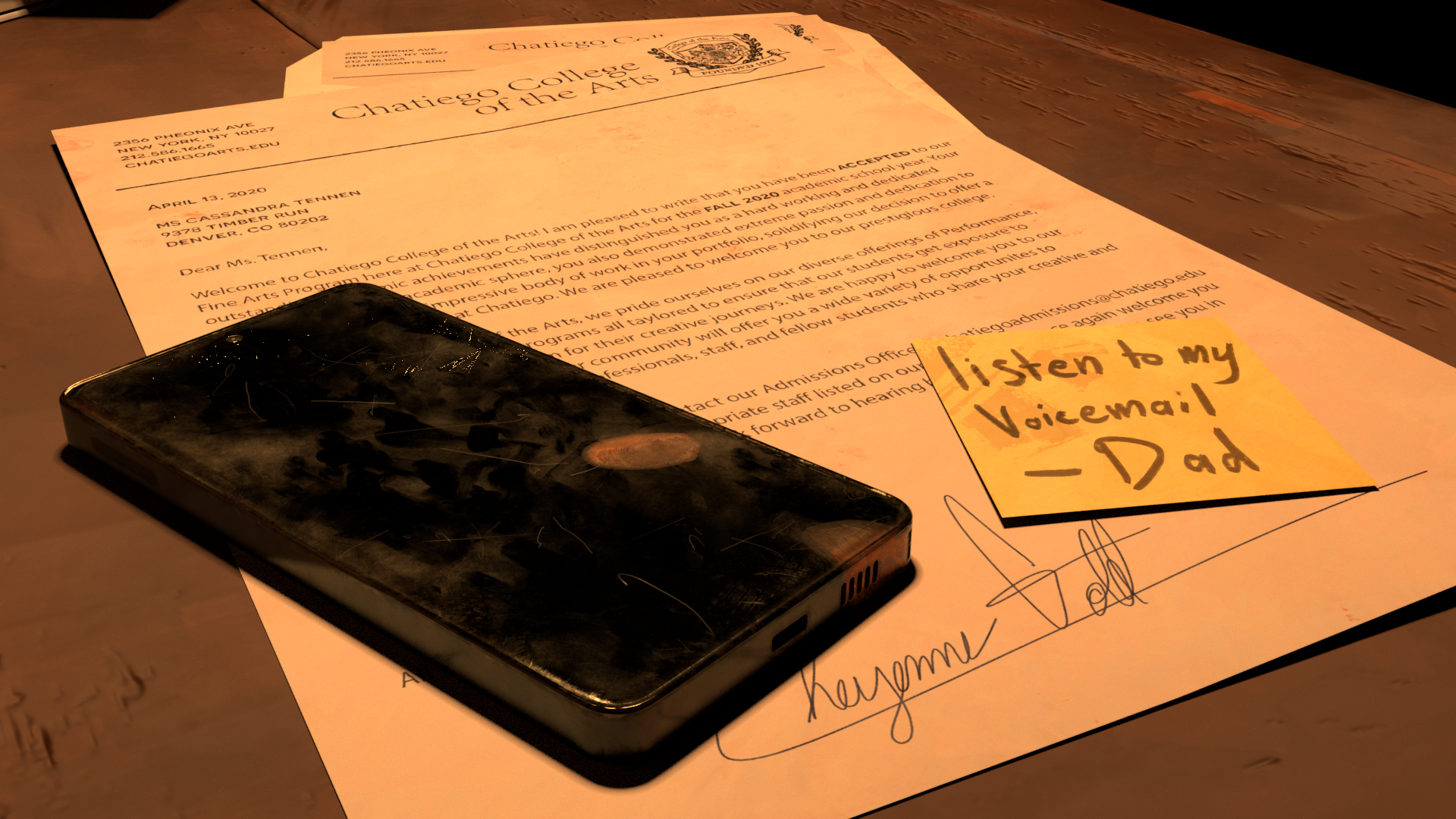
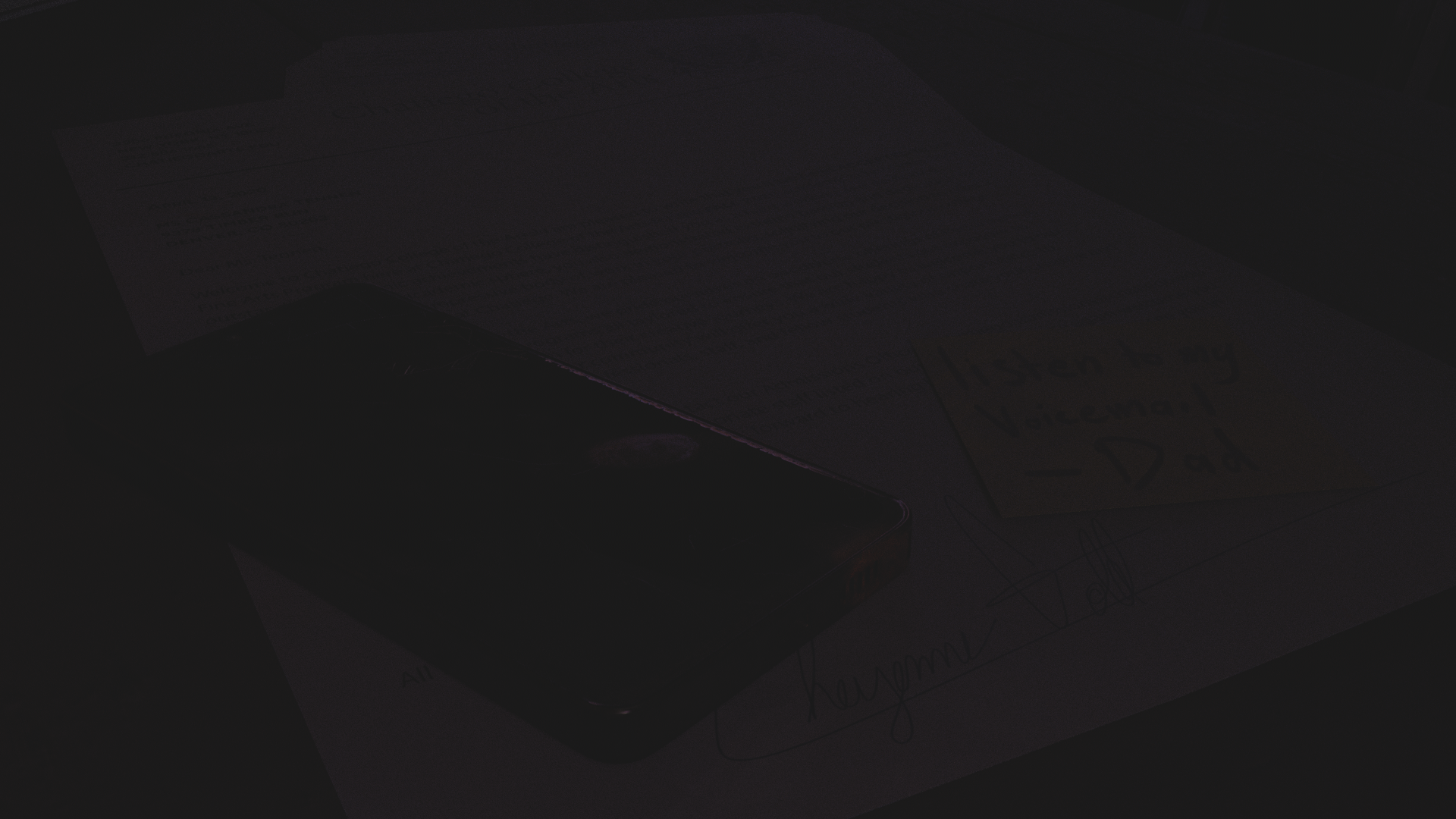
As the establishing shot of the short, I wanted to make sure the phone was the focal point to connect the viewer to the audio of the voicemail, and also establish that we are in a painting studio. The camera slowly pushes in towards the phone with painting supplies scattered around and used the lighting to create a clear foreground and background for the shot.
Storyboard
Whitebox
Lighting
Final Comp
Storyboard
Layout
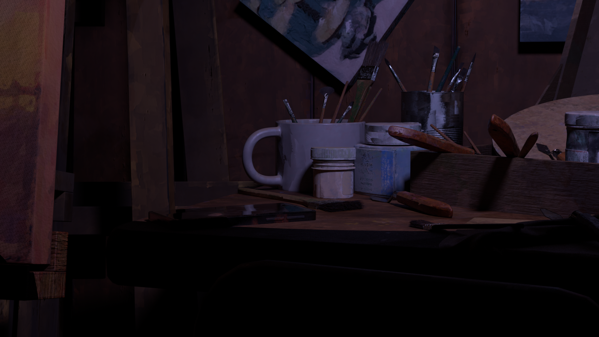
The purpose of this shot was to continue establishing the space. I wanted to highlight the lived in aspect of the room and make it clear that this space is actively used and worked in. A handheld effect was added in post as to keep visual interest and make it feel like the audience was in the room.
Storyboard
Whitebox
Lighting
Final Comp
Storyboard
Layout
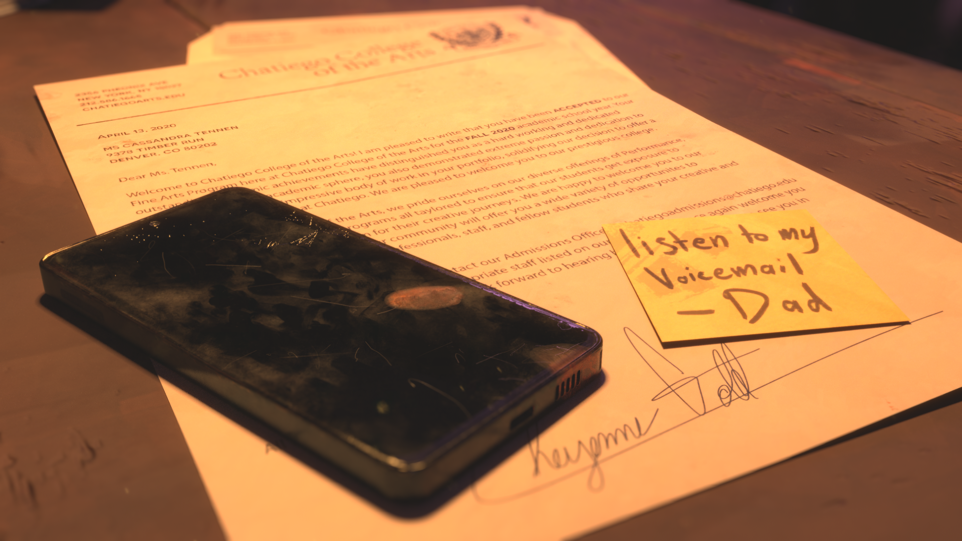
With this shot, I wanted to establish the conflict, the letter that the Dad is referring to in his voicemail. Connecting his words to something in the scene was important in getting the audience to follow the story. Camera shake was again added in post.
Storyboard
Whitebox
Lighting
Final Comp
Storyboard
Layout
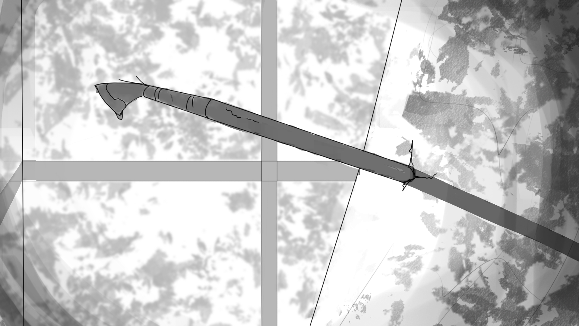
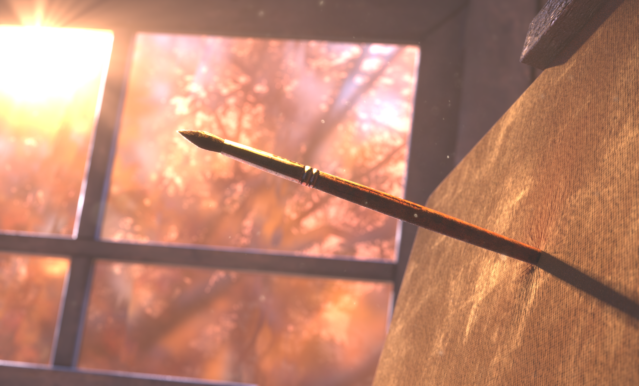
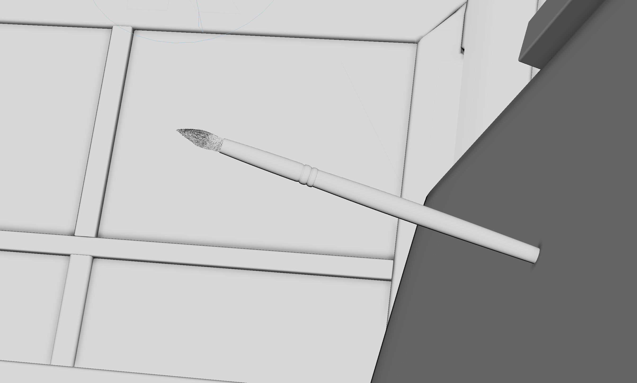
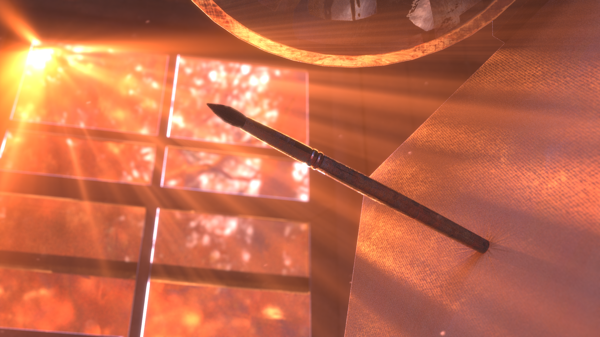
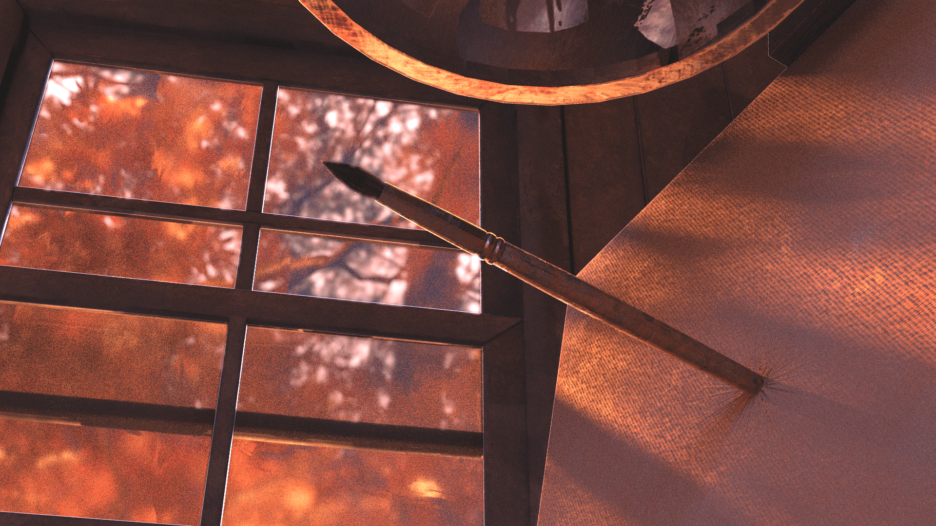
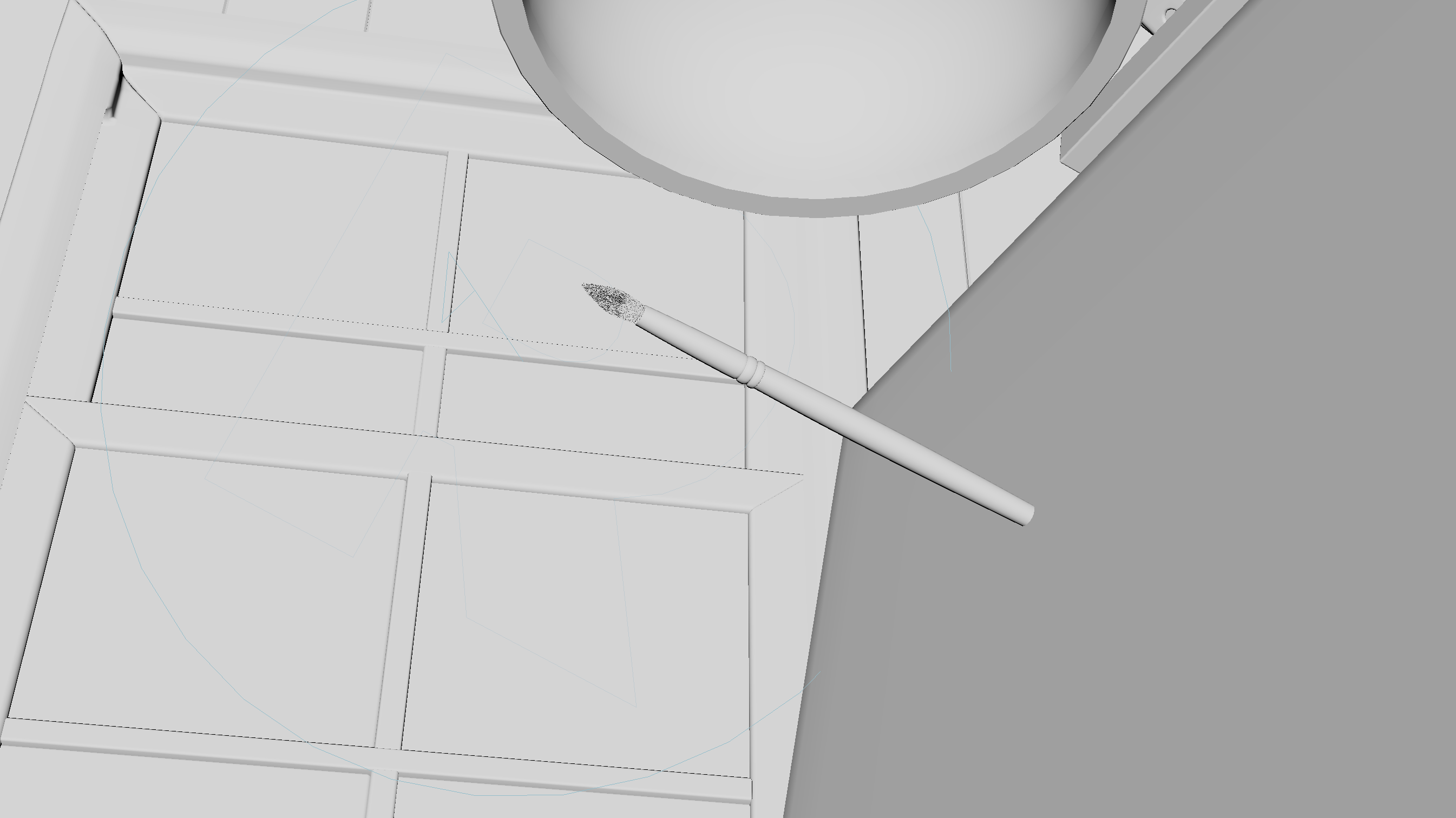
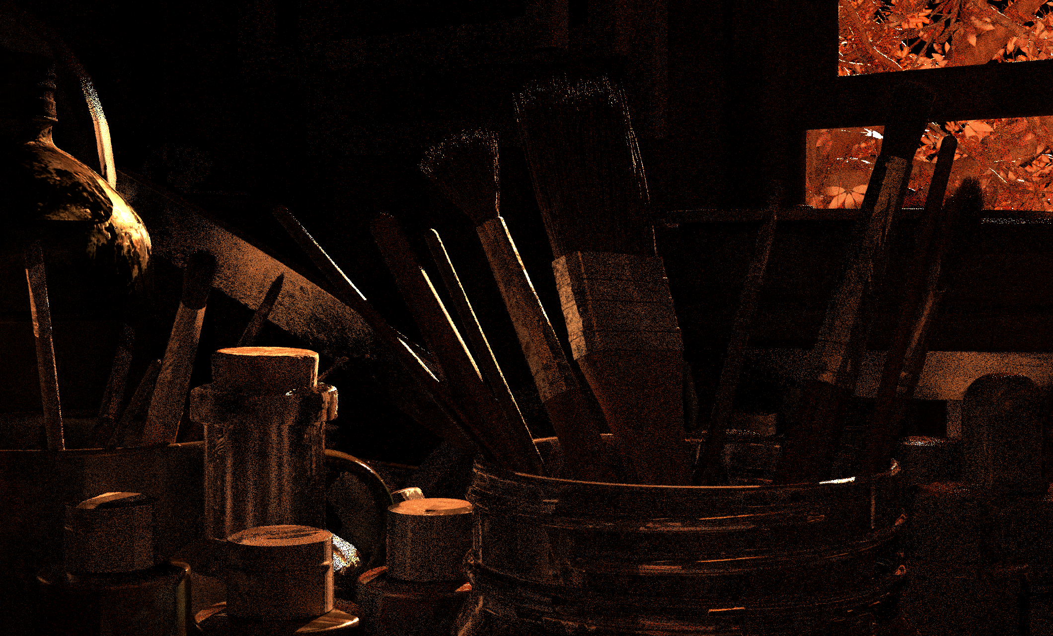
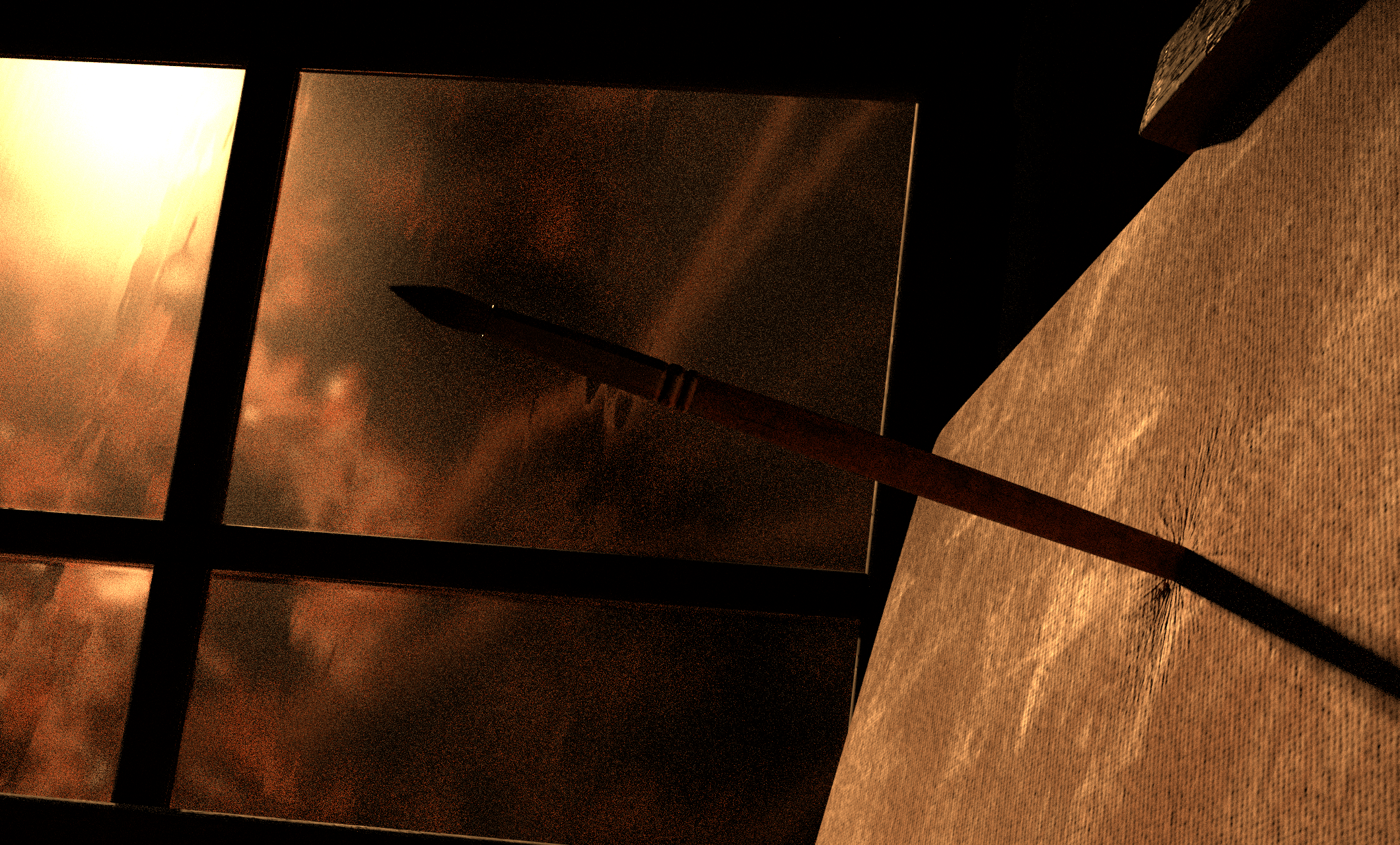
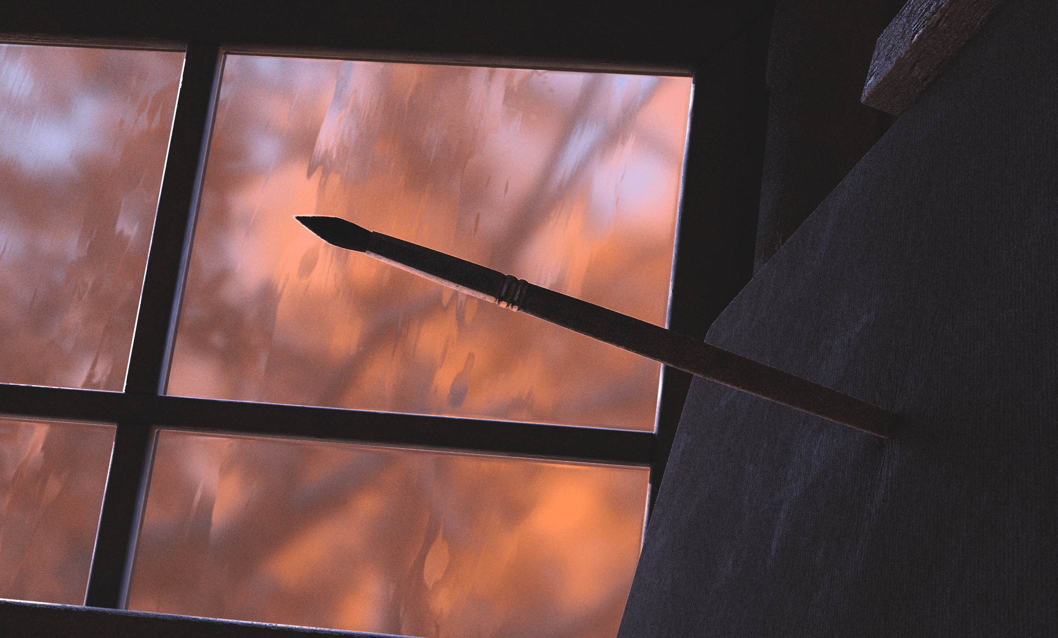
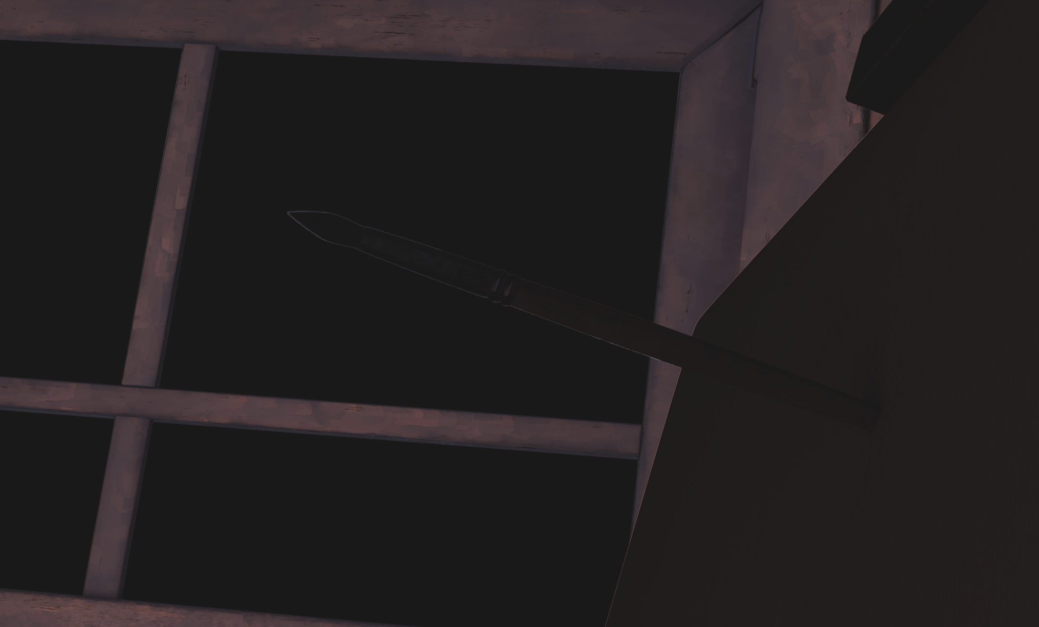
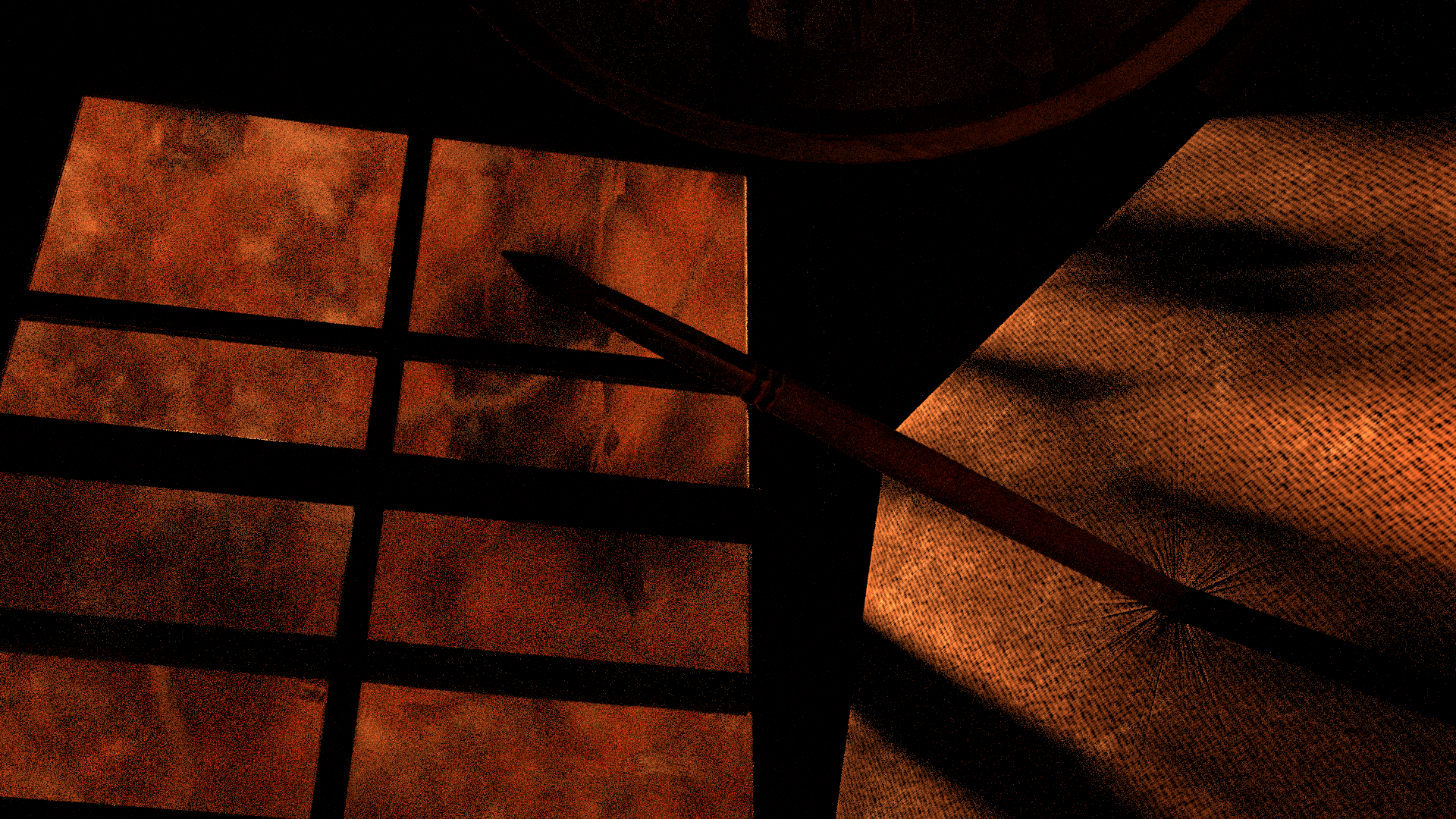
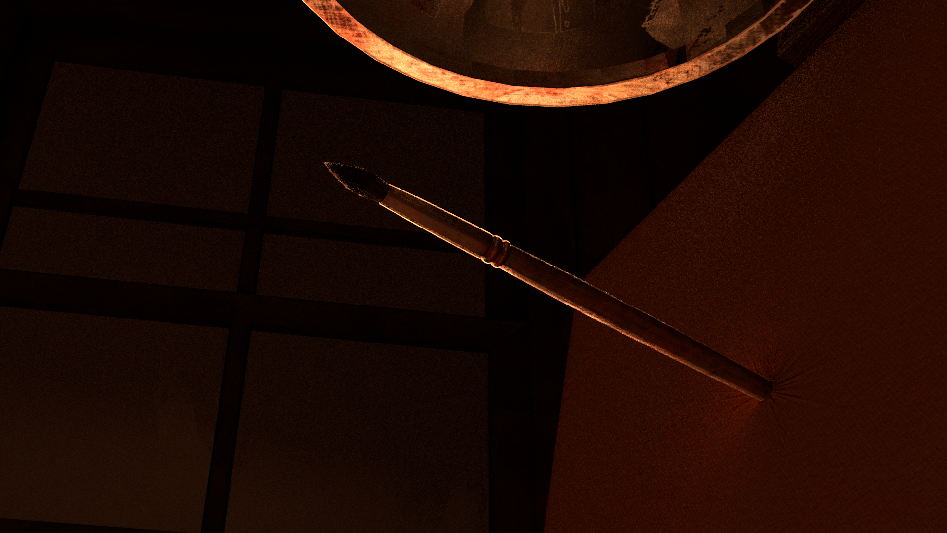
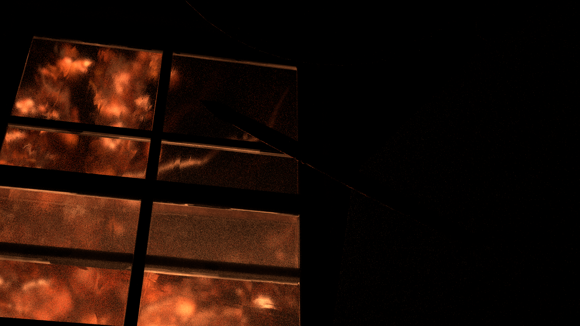
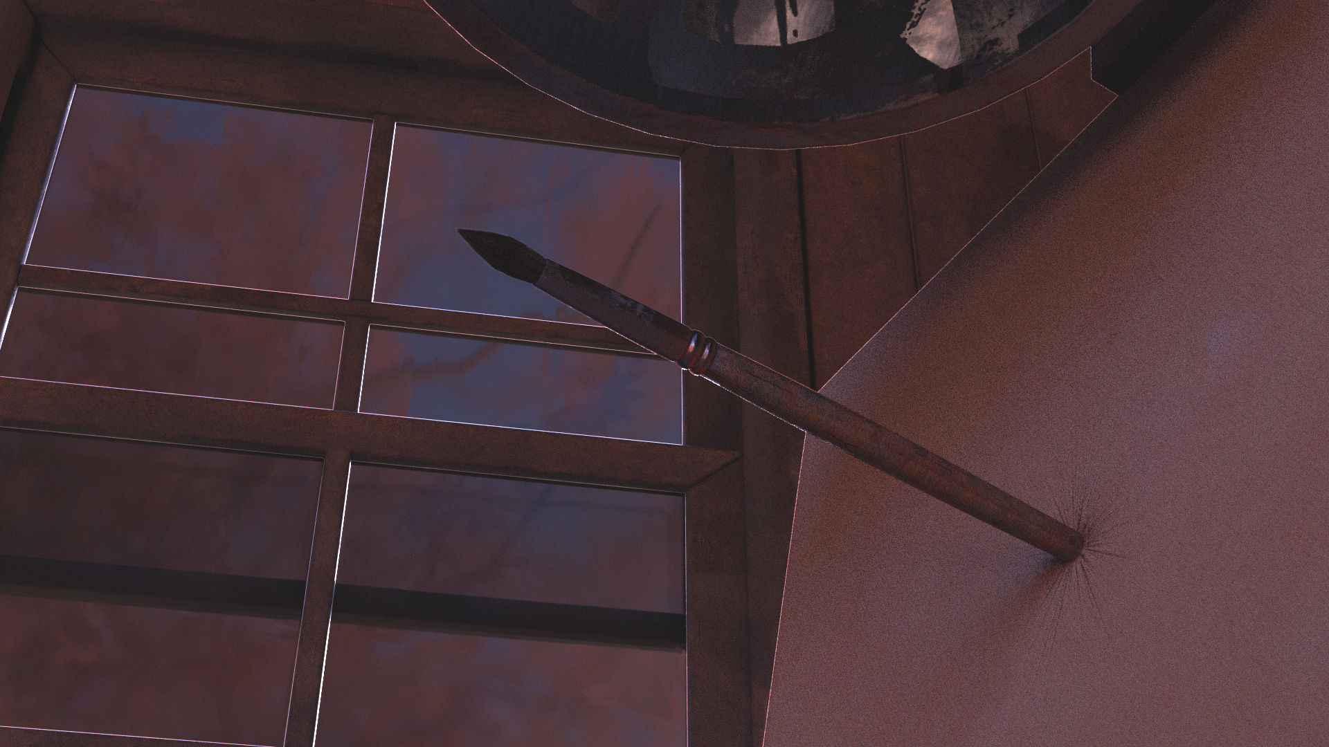
I wanted to use this next shot to establish the argument referred to in the voicemail, and by extension, Cass' internal struggle. The brush stabbed into the canvas became an important symbol moving forward, and I opted to return to this image later in shot 8
Storyboard
Whitebox
Lighting
Final Comp
Storyboard
.png)
Layout
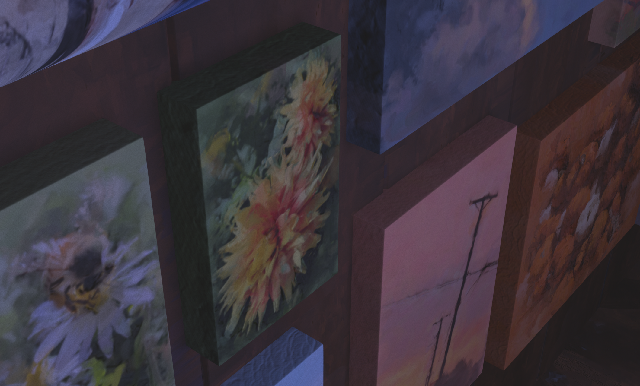
This shot went through the most change, originally being more high angle and moving along a shelf above the desk. While putting together the edit however, it became clear that the angle was too dramatic and was quite jarring between cuts. I opted to soften the angle and shorten the distance the camera would move in order to get the same effect of showing off Cass' work desk without the jarring angle change between shots.
Storyboard
Whitebox
Lighting
Final Comp
Storyboard
Layout
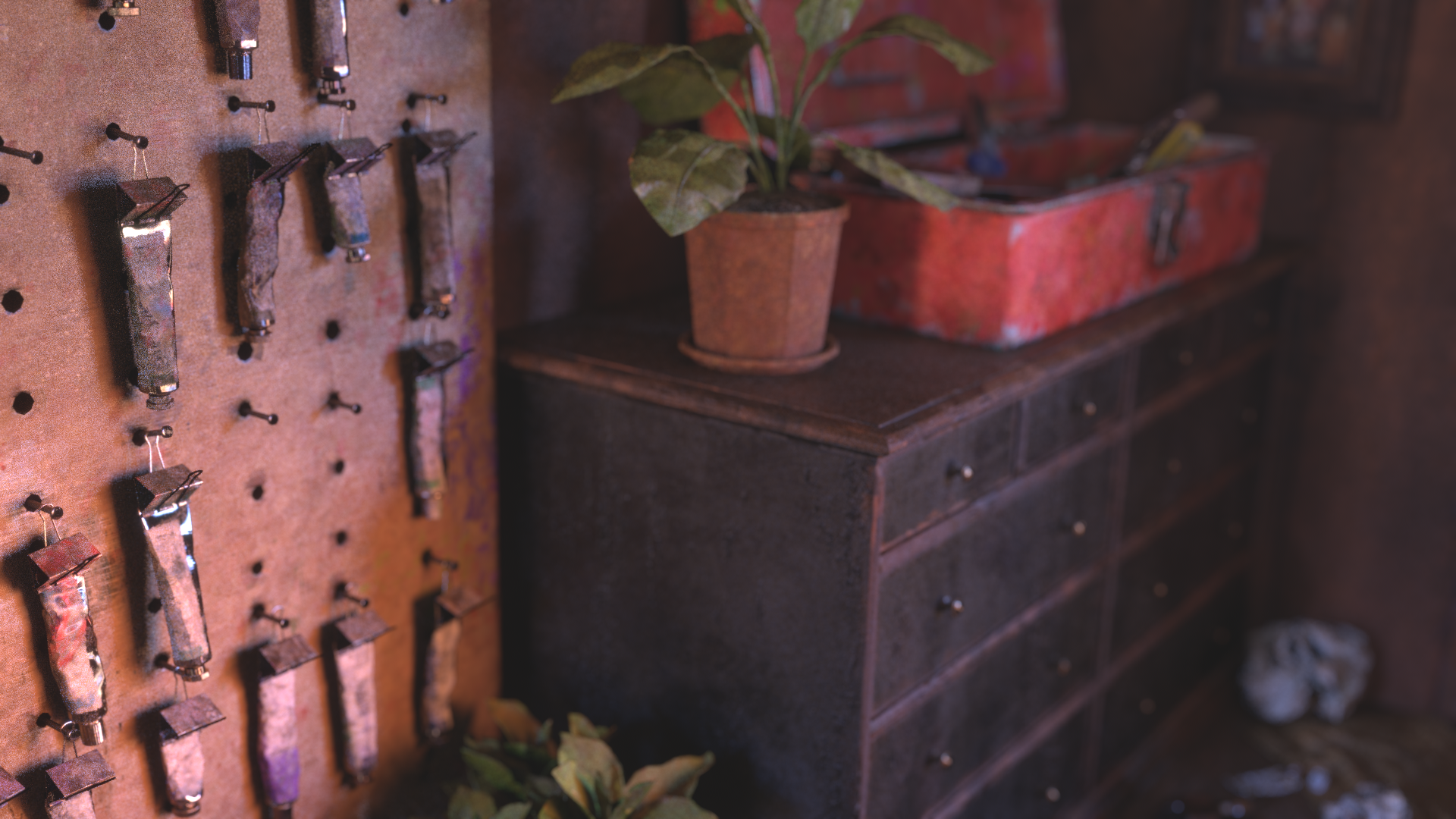
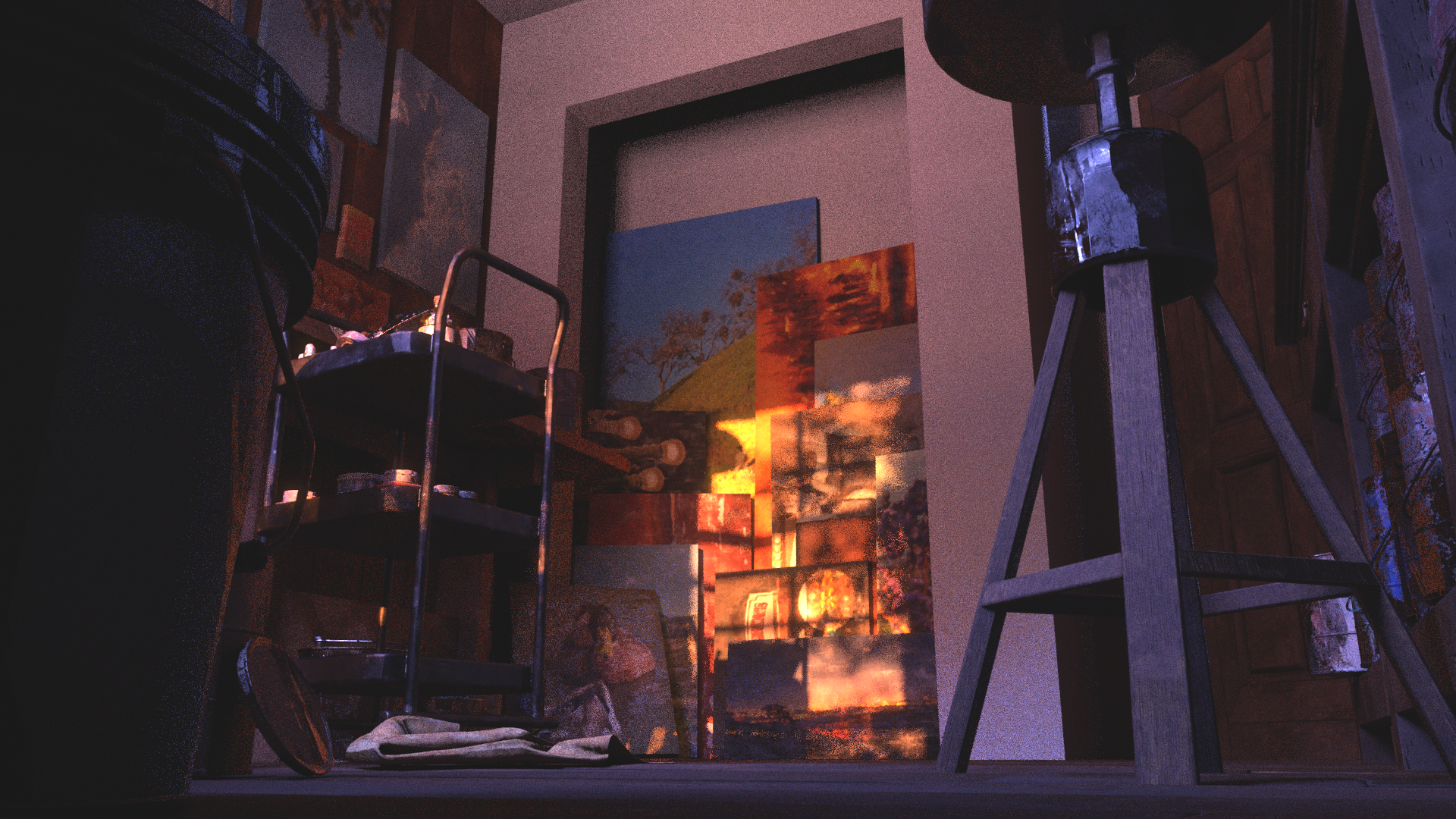
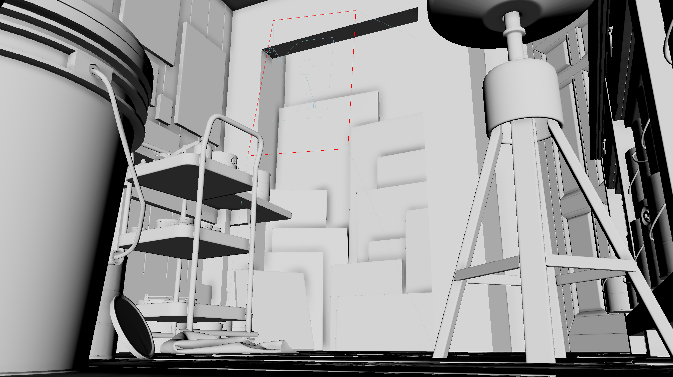
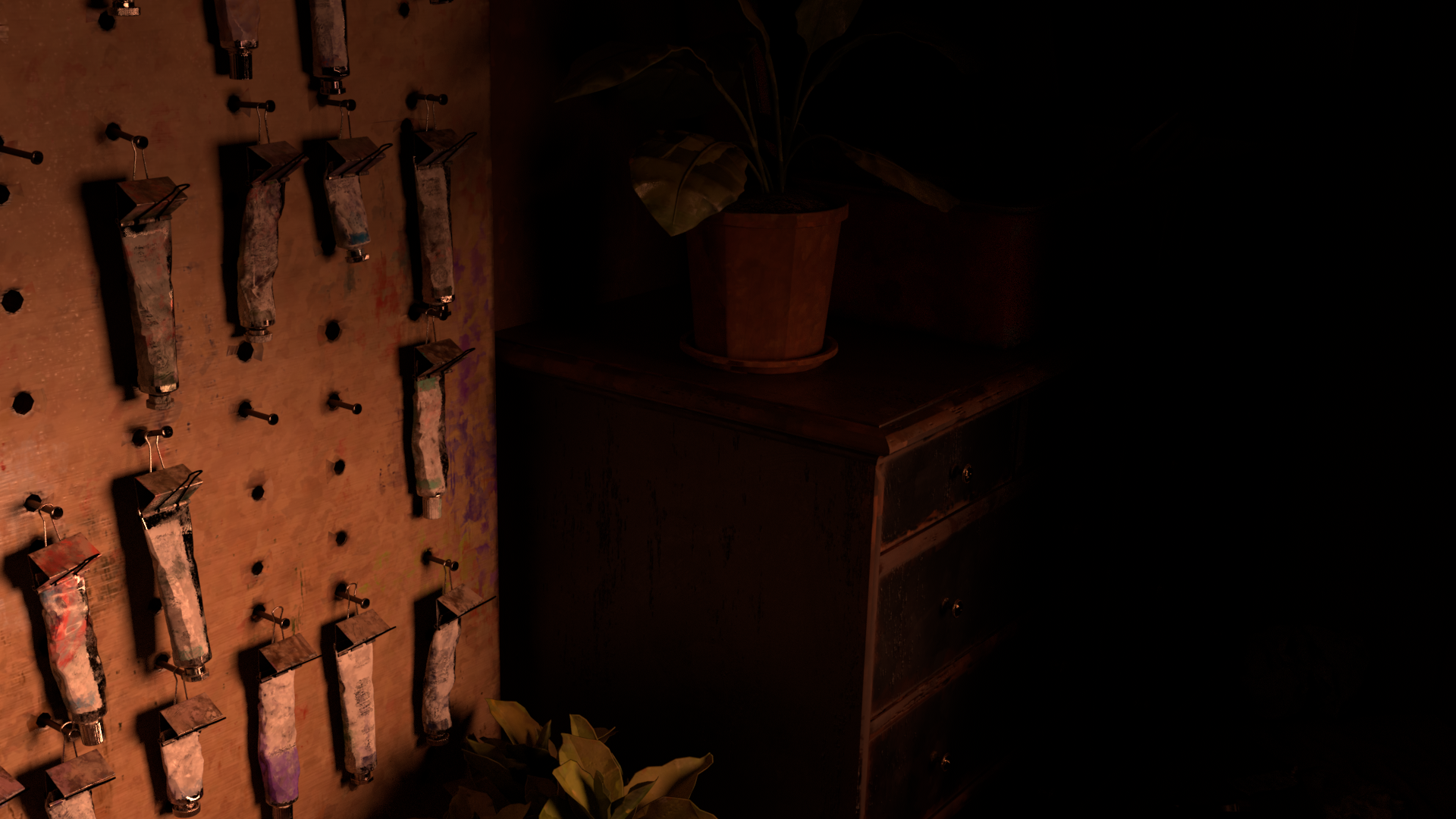
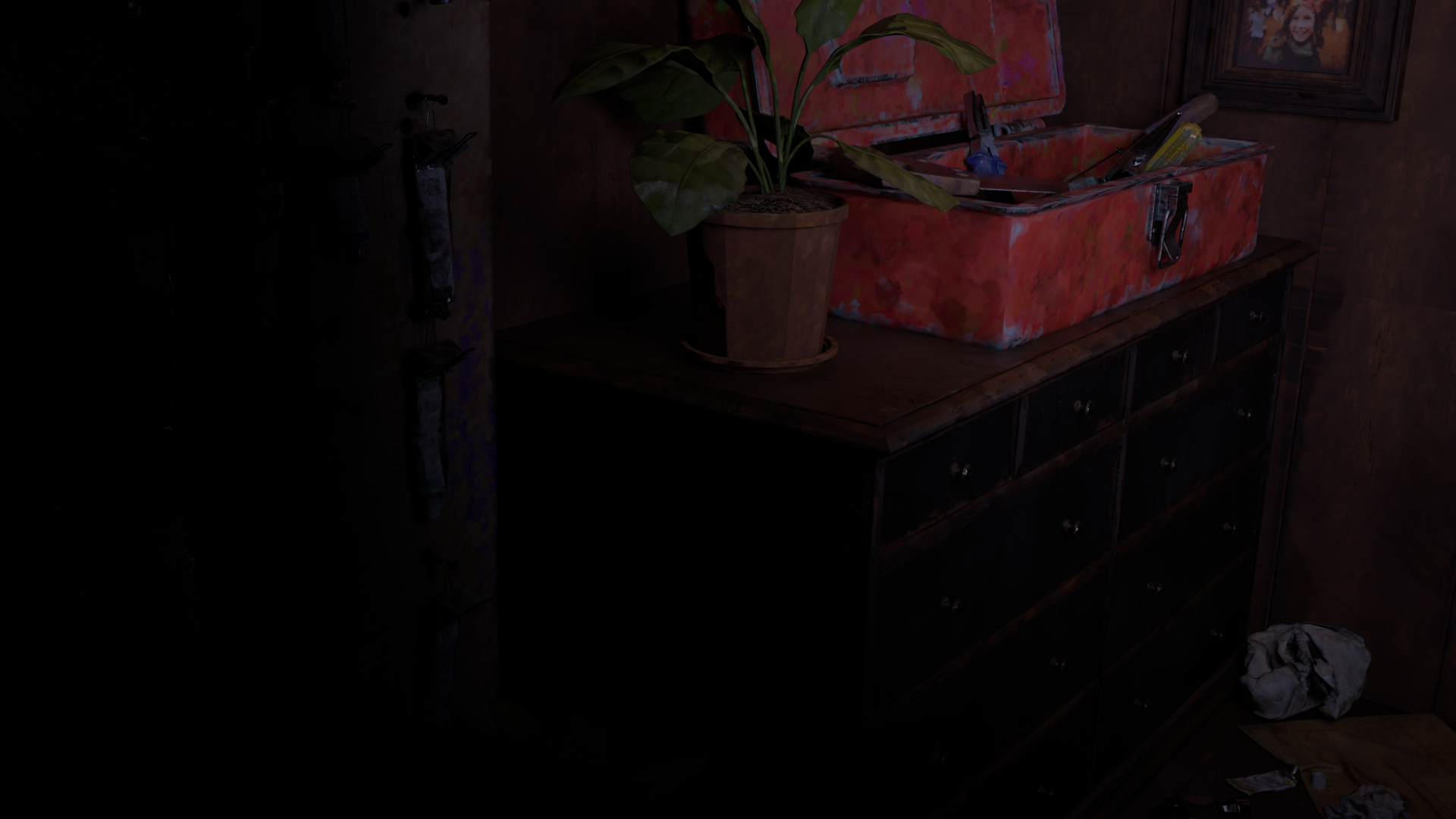
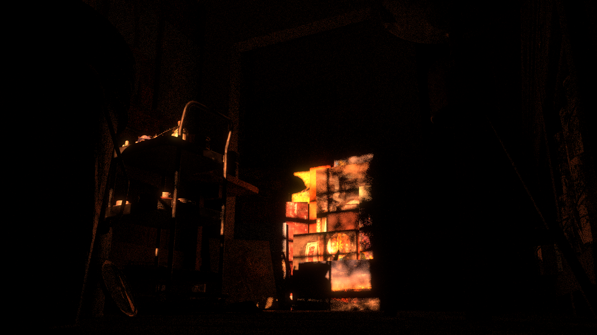
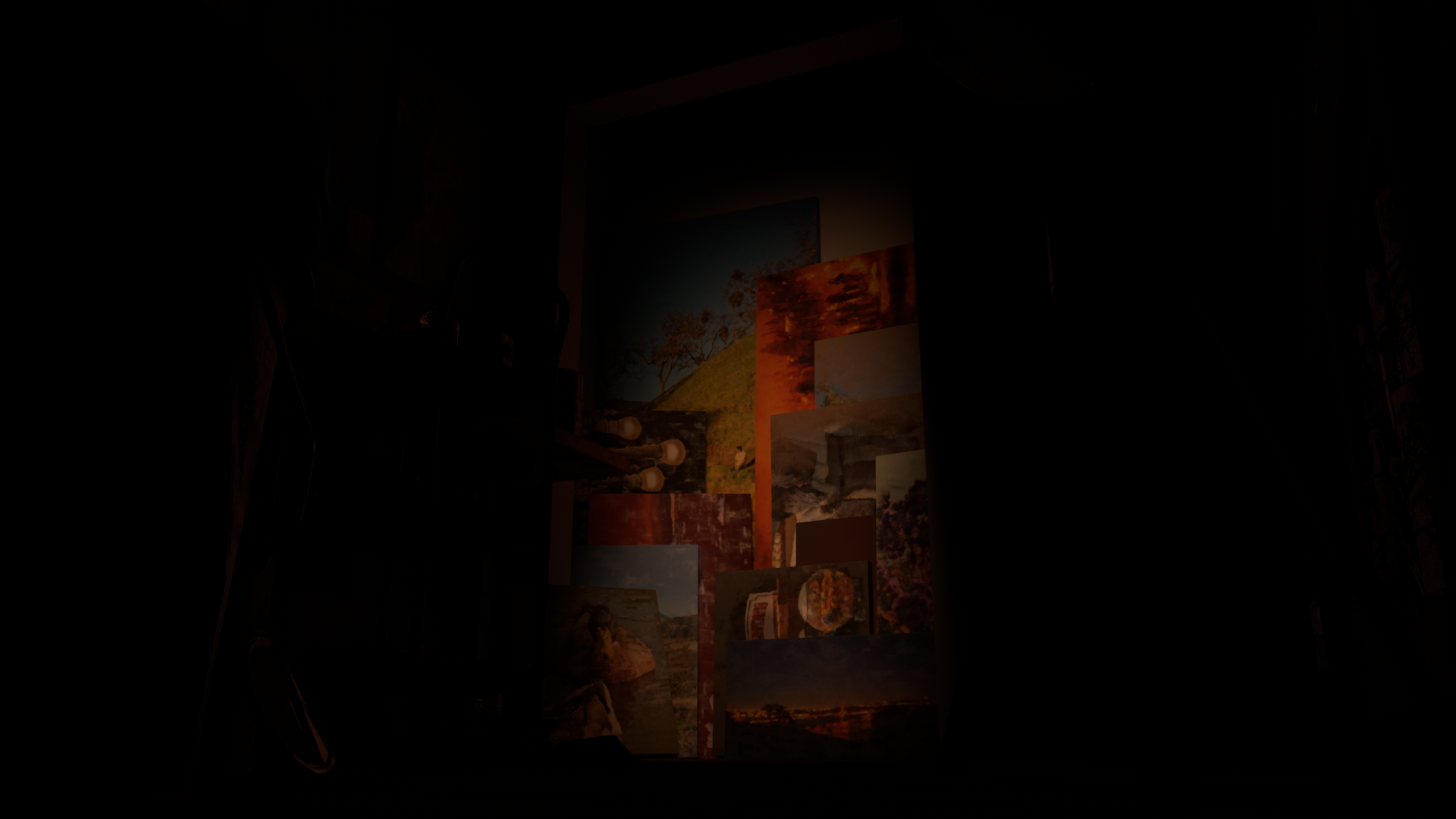
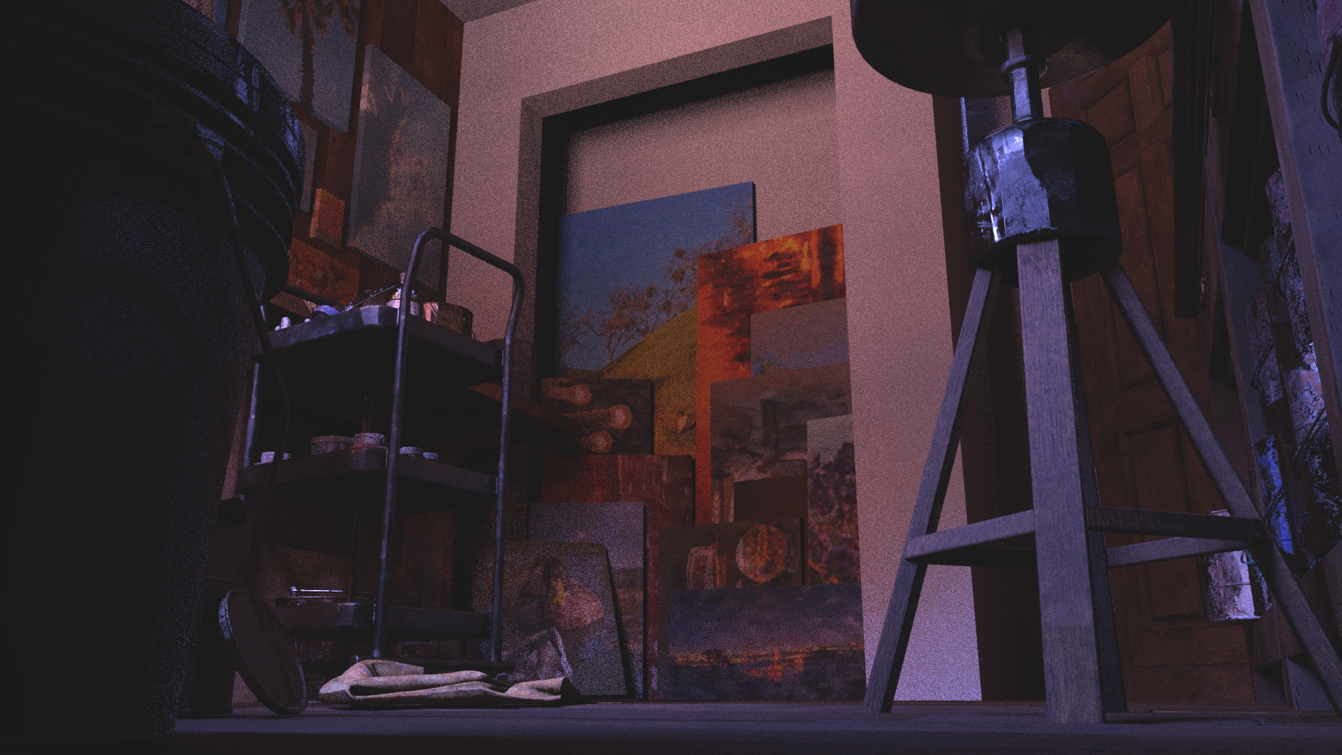
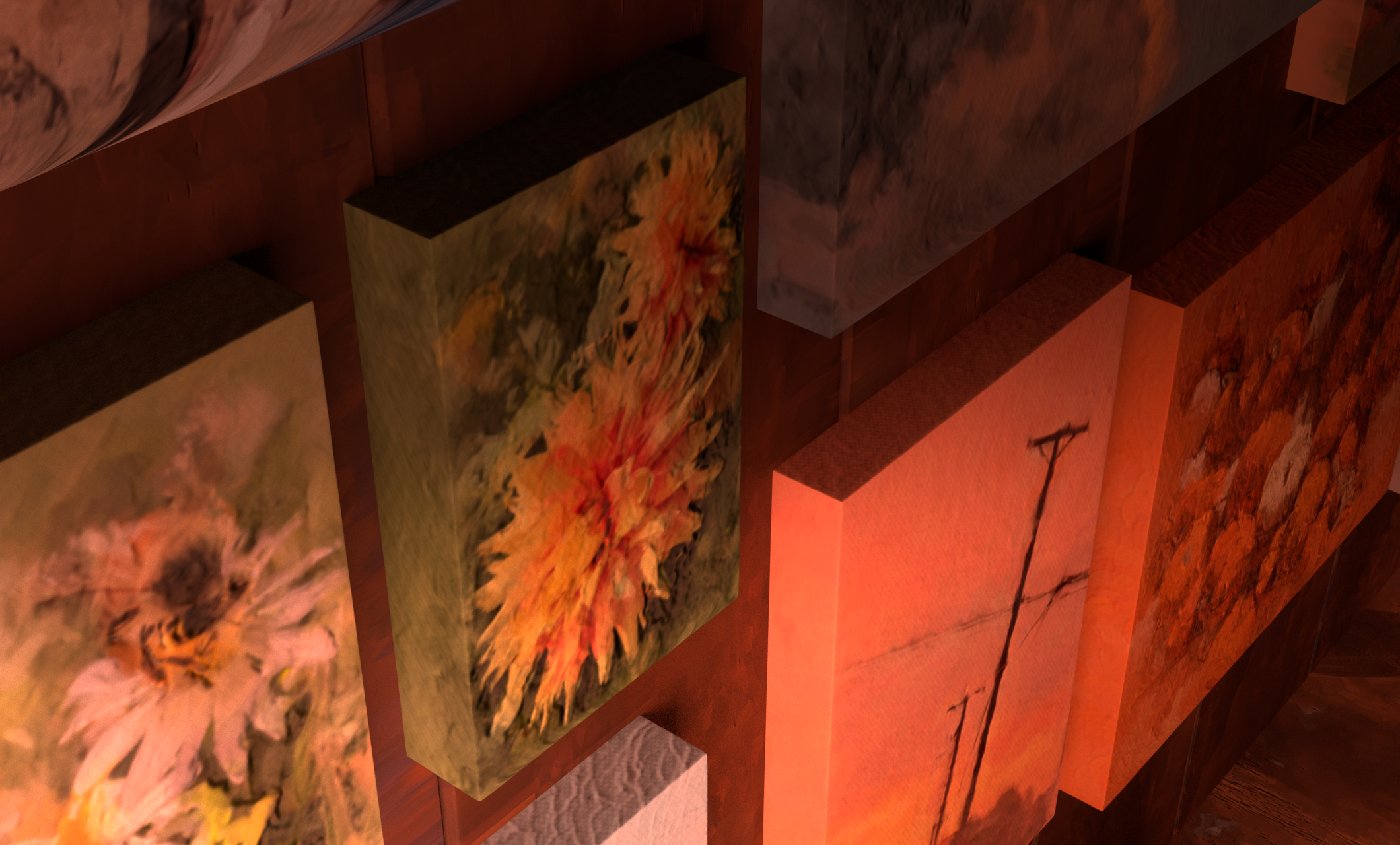
In shot 6, the camera pushes in slowly to the open closet housing a pile of finished paintings. I wanted this shot to really drive home how dedicated Cassandra was to her craft, and it also gave me the opportunity to start visually displaying the shift in time in the room to later in the day with the lighting.
Storyboard
Whitebox
Lighting
Final Comp
Storyboard
Layout
This shot stayed pretty similar to it's storyboard throughout the project. I decided to flip the image since I felt that it worked better with the transition from shot 6. I softened the angle from where I had it originally as to not run into the same issue I had with shot 5 where the angle was too steep.
Storyboard
Whitebox
Lighting
Final Comp
Storyboard
Layout
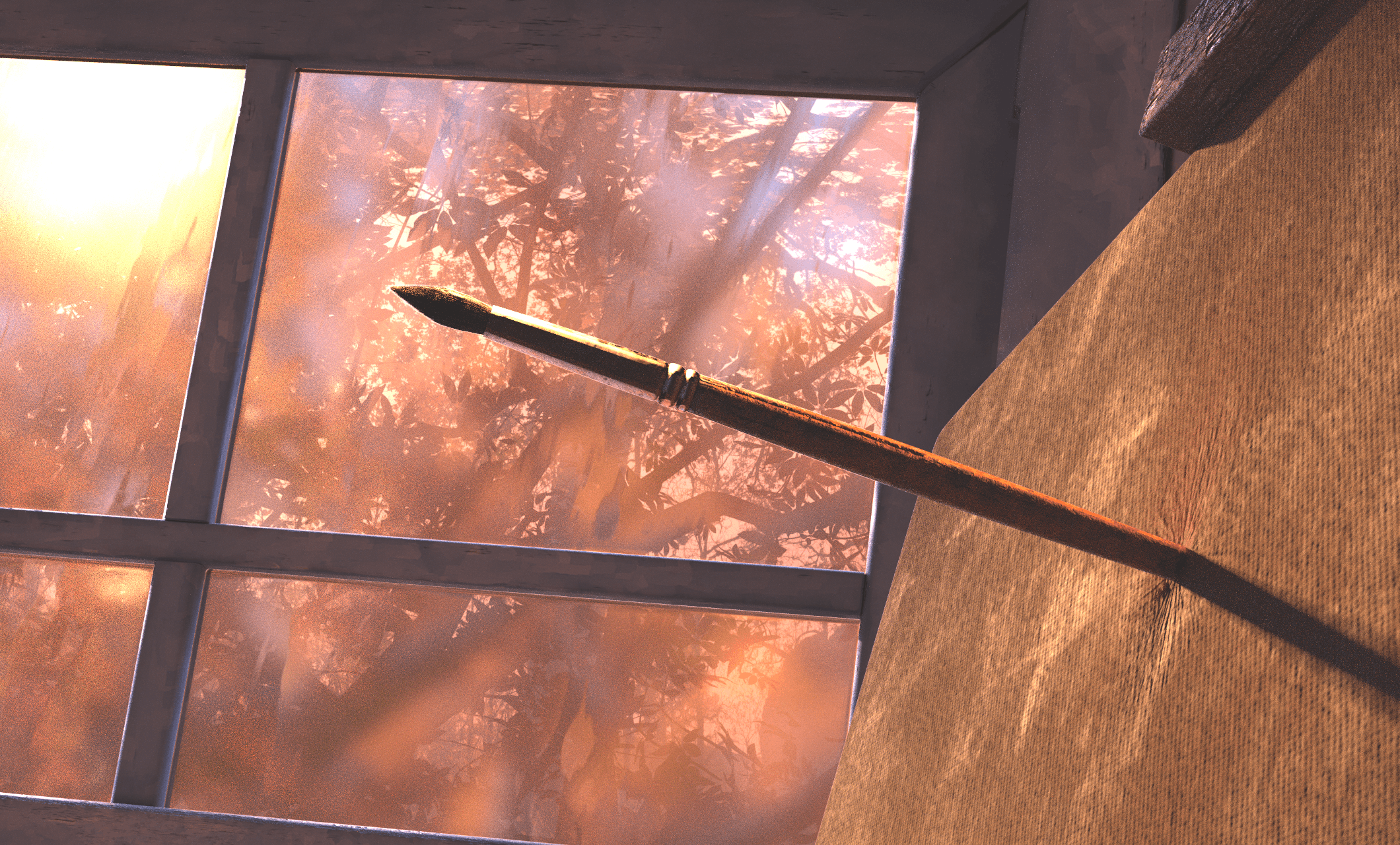
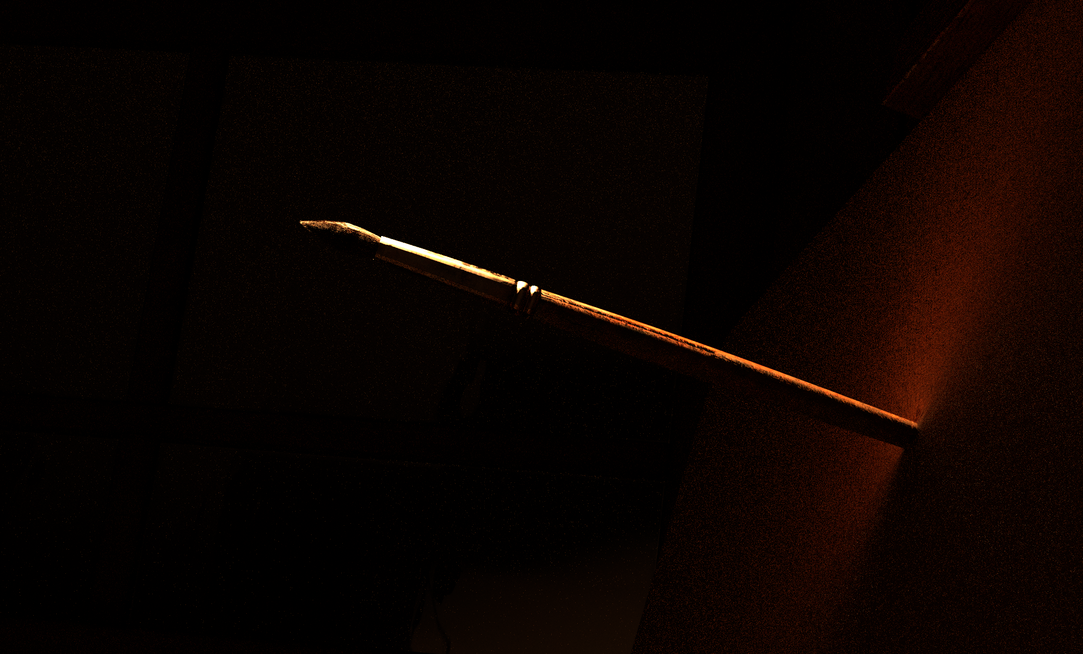
Shot 7 proved to be the most difficult when figuring out the framing. I really enjoyed the framing of my storyboard, but when putting together the scene, the proportions of the objects made it impossible to recreate it 1:1. I ended up having to recreate the scene and scale everything differently to create the exaggerated proportions. The camera pulls back slowley to better match the storyboard and give the audience more time with the brush in the canvas.
Storyboard
Whitebox
Lighting
Final Comp
Storyboard
Layout
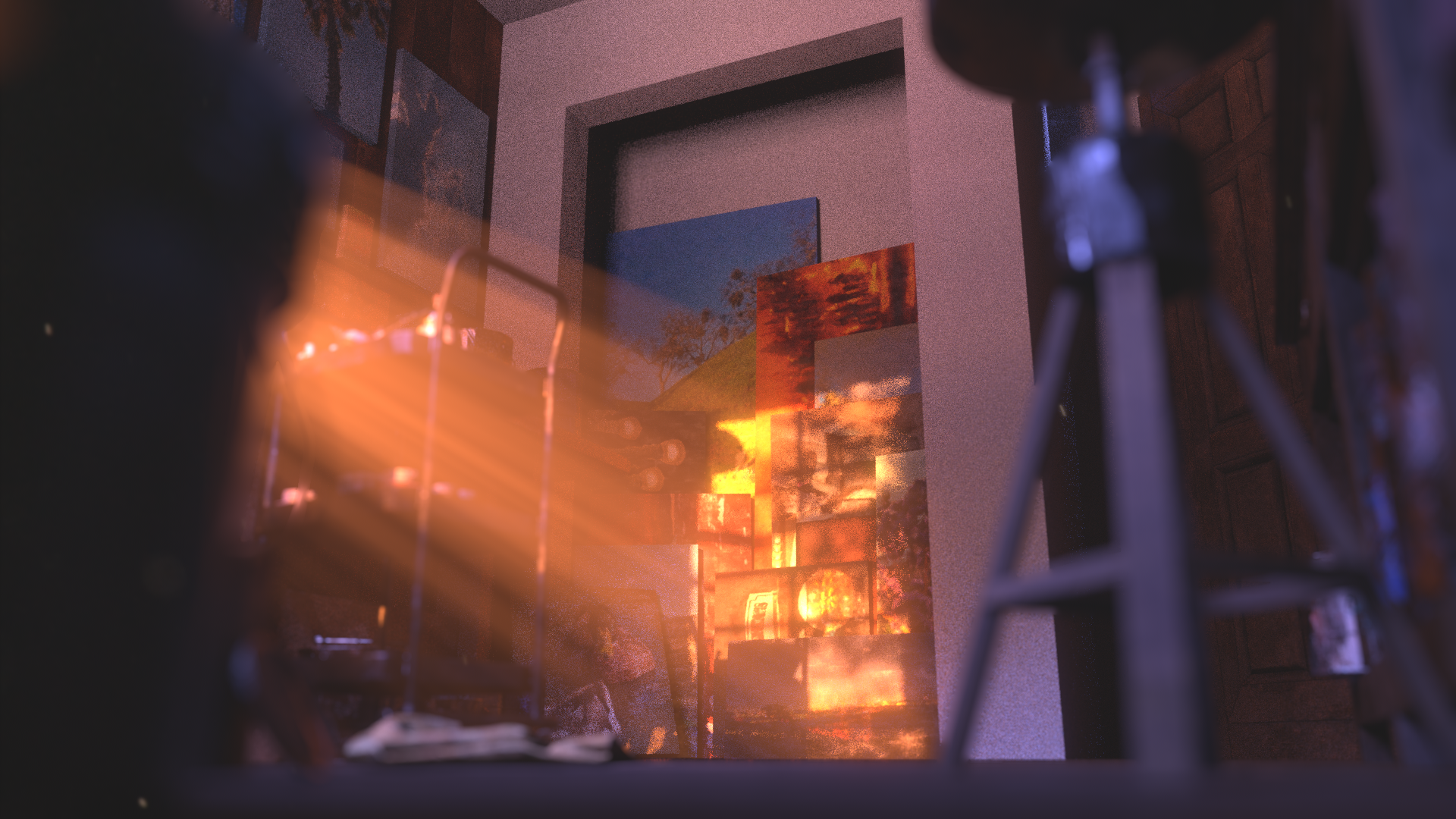
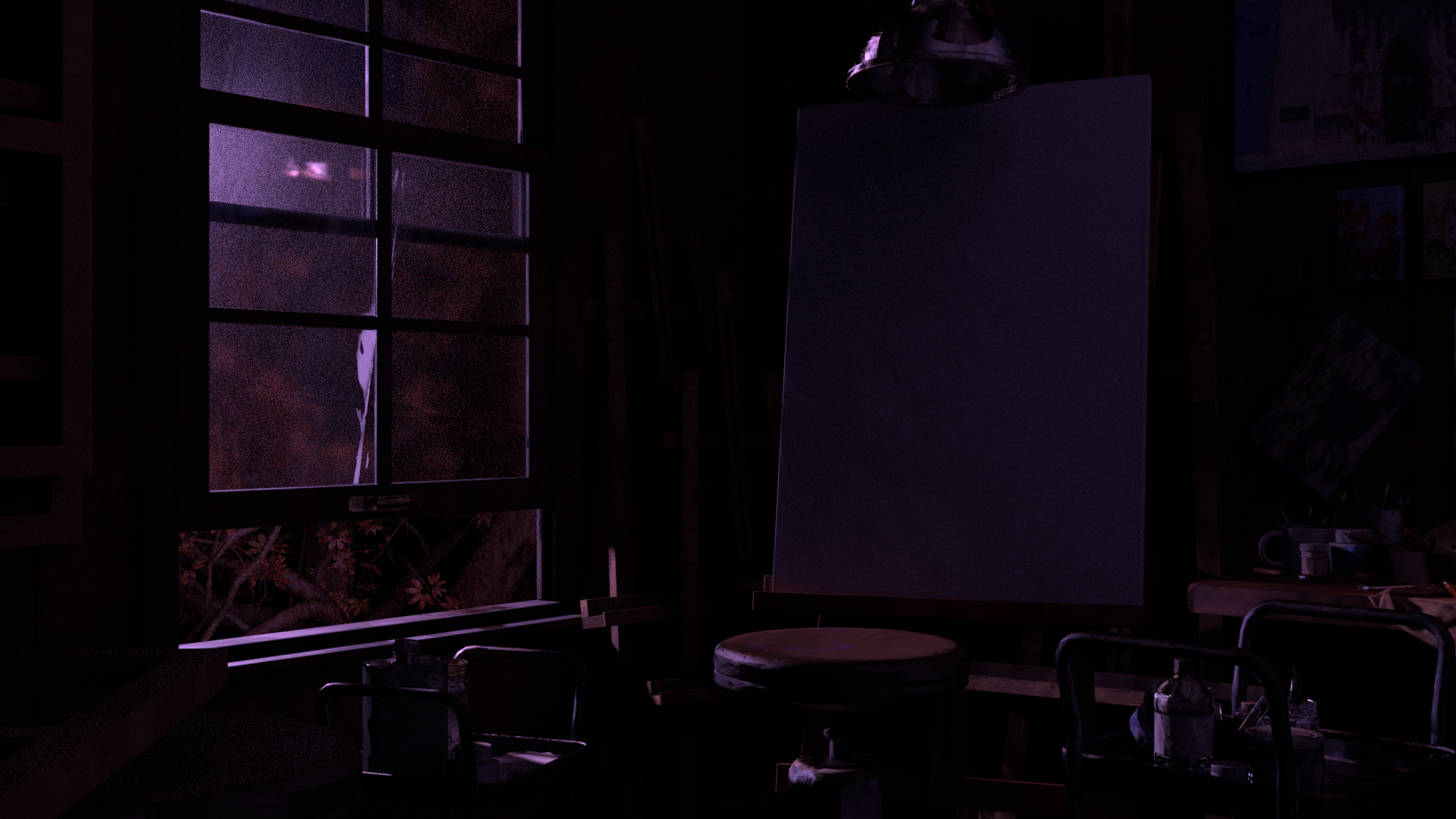
I wanted to highlight the start and end frame of shot 9 as they are vastly different from one another. This starting frame was originally the end frame in an earlier version of the short where the room stayed static and nothing changed. I wanted to have a wider shot of the room to allow the audience a breath of relief and to fully contextualize the variety of close-up shots they had recieved earlier in the short.
Storyboard
Whitebox
Lighting
Final Comp
Storyboard
Layout
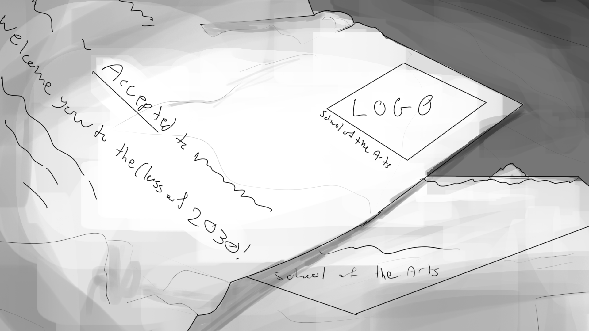
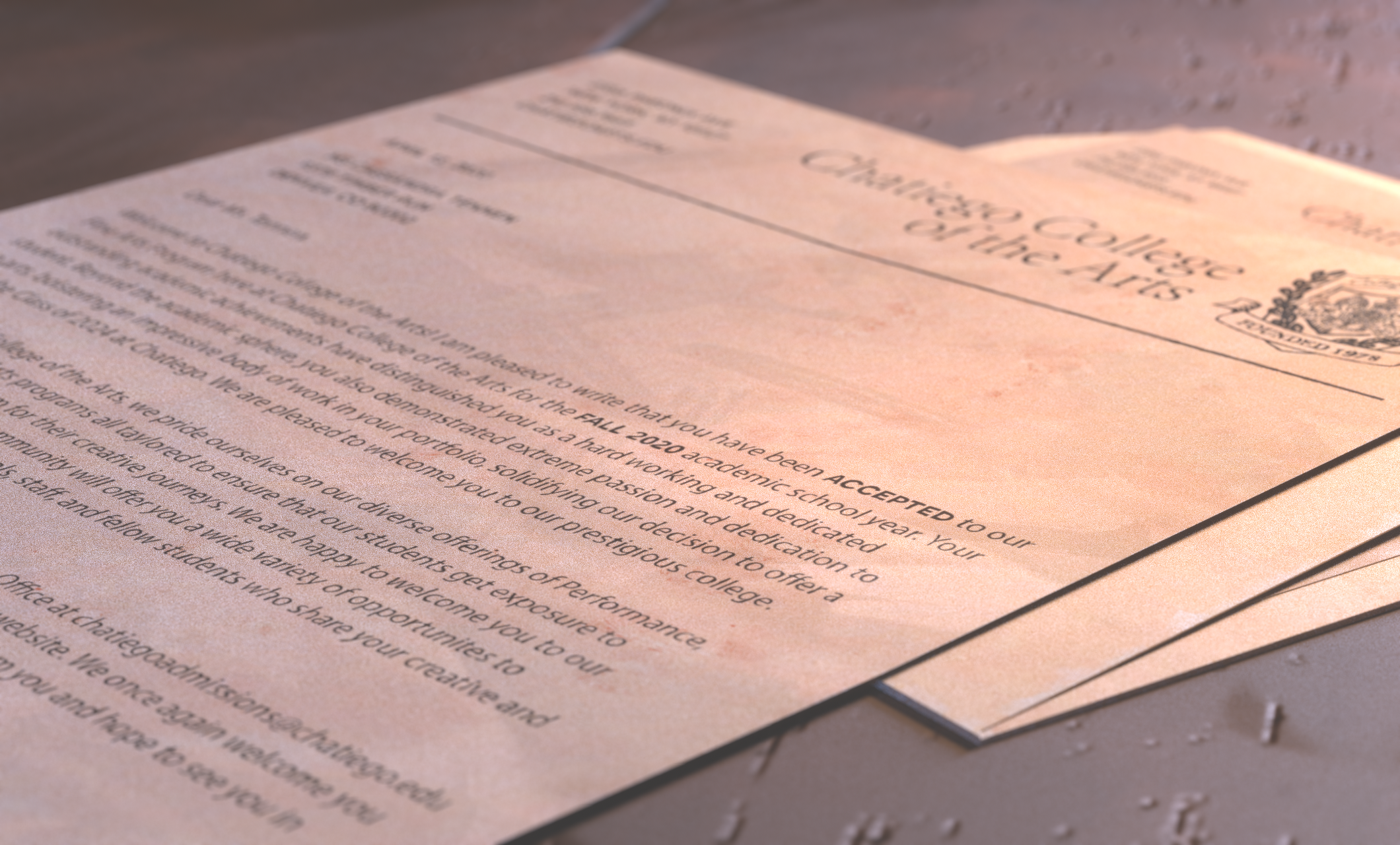
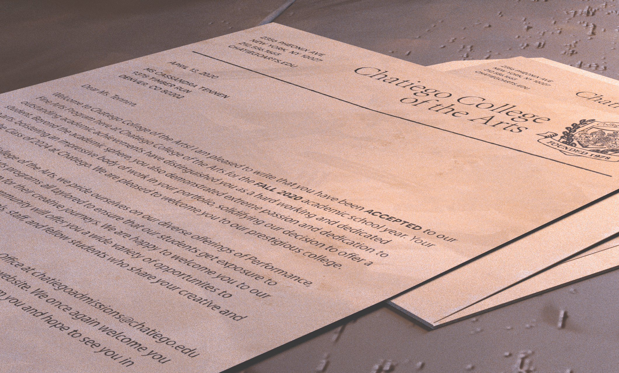
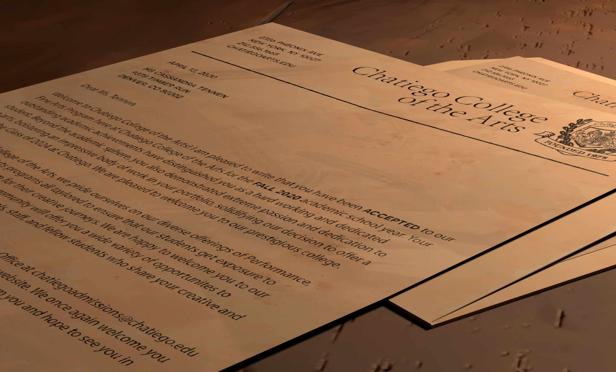
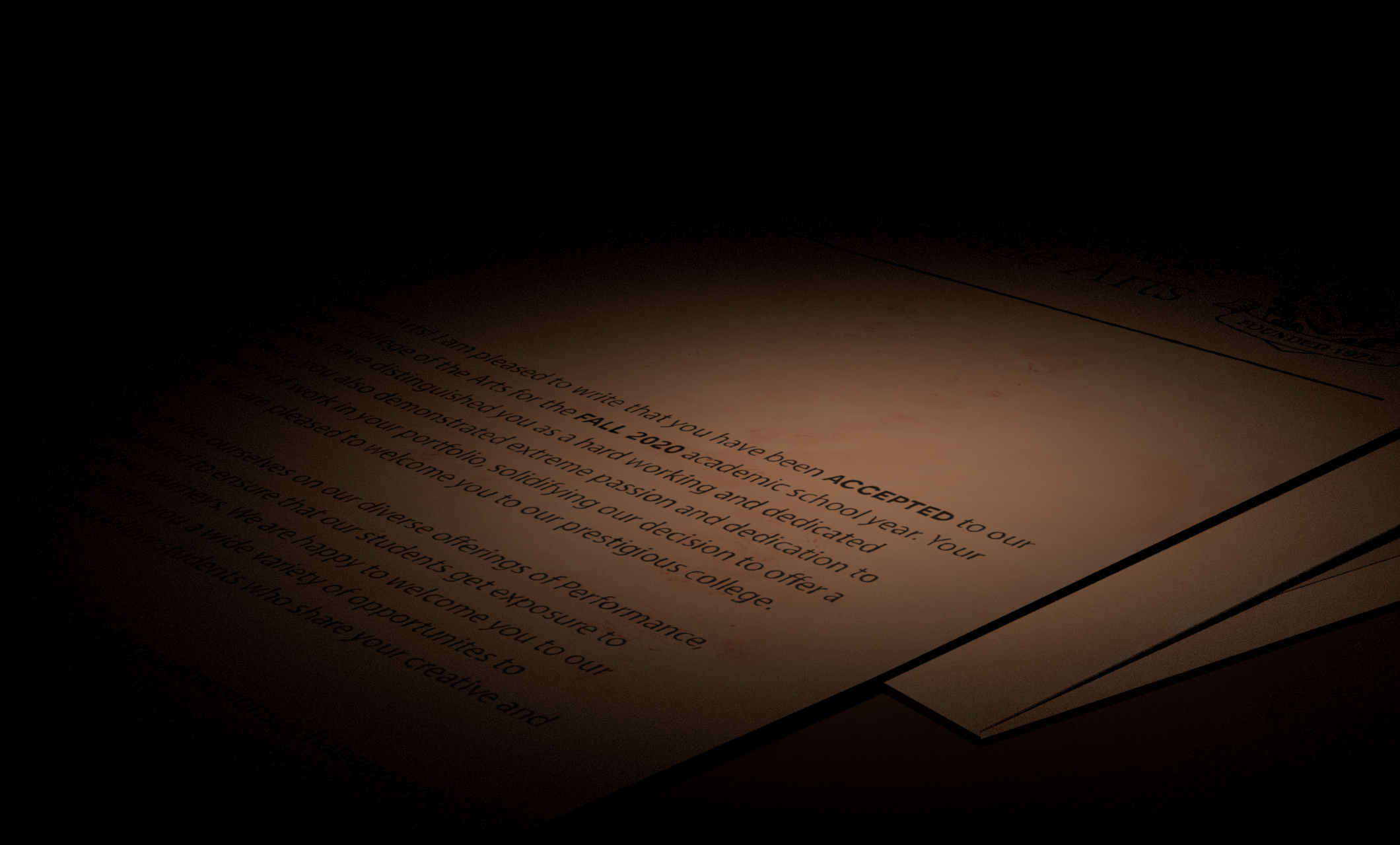
The idea behind this shot was to show the connection between Cass' passion on the canvas and how it aligns with the college acceptance letter. The purpose of this shot changed as the story shifted to show that the Dad had been in the room. The focus became the sticky note and the phone on the acceptance letter, showing the connection between the supportive voicemail and the letter.
Storyboard
Whitebox
Lighting
Final Comp
The lighting in Paint was meant to feel realistic while also pushing the color and vibrancy of the sunset. I wanted to be able to see how time was progressing throughout the short through the lighting and temperature of the lights in the scene, starting in the mid-afternoon, and ending at twilight.
You can view the shot breakdown below by clicking on the tabs.
Final Comp
.png)
Light Groups
I wanted to have a very clear separation between the foreground and background so that the phone would be the main focal point. The sun being warm and the background being cooler along with directing the light to only hit the front part of the table helped immensely to acheive this.
Beauty
Sun Key
Phone Key
Phone Rim
Dome
Room Fill
Final Comp
Light Groups
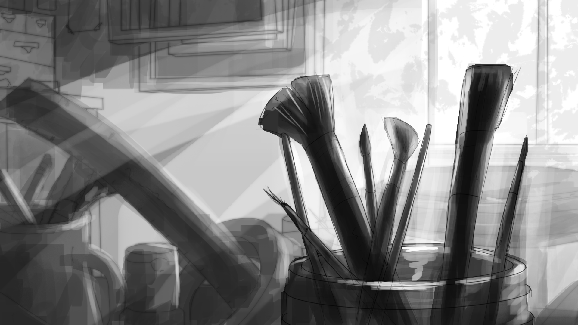
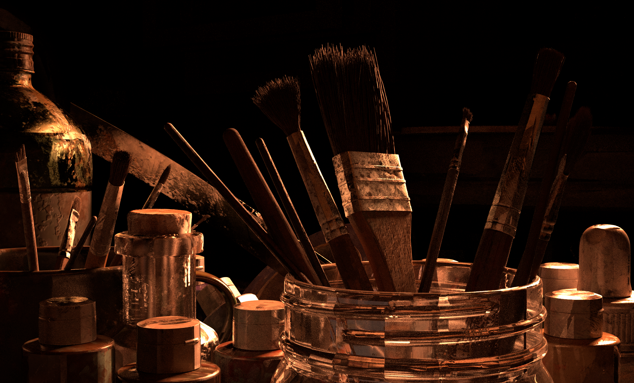
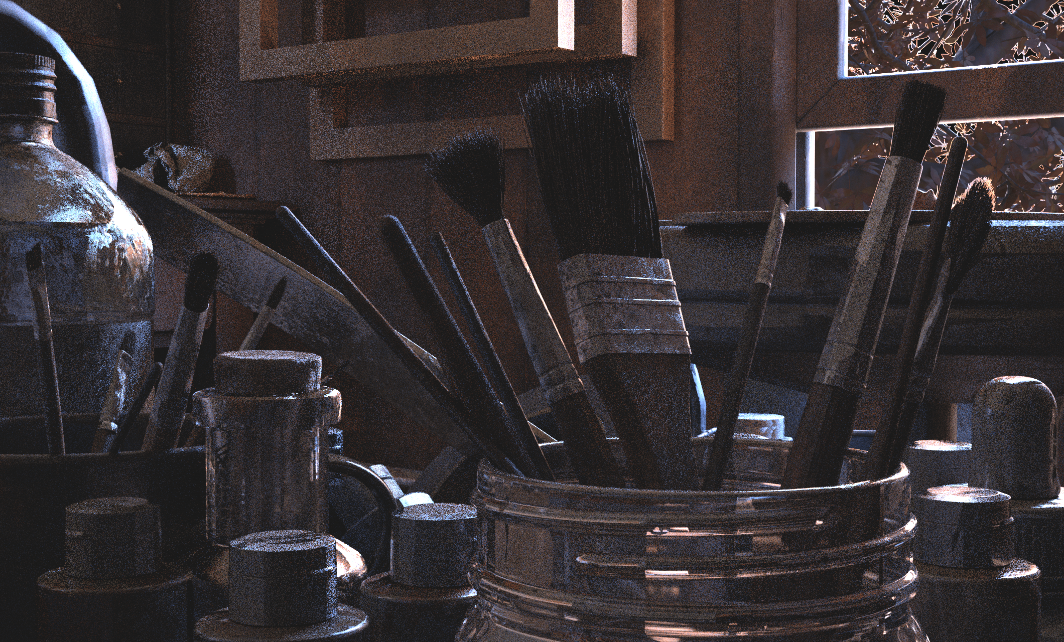
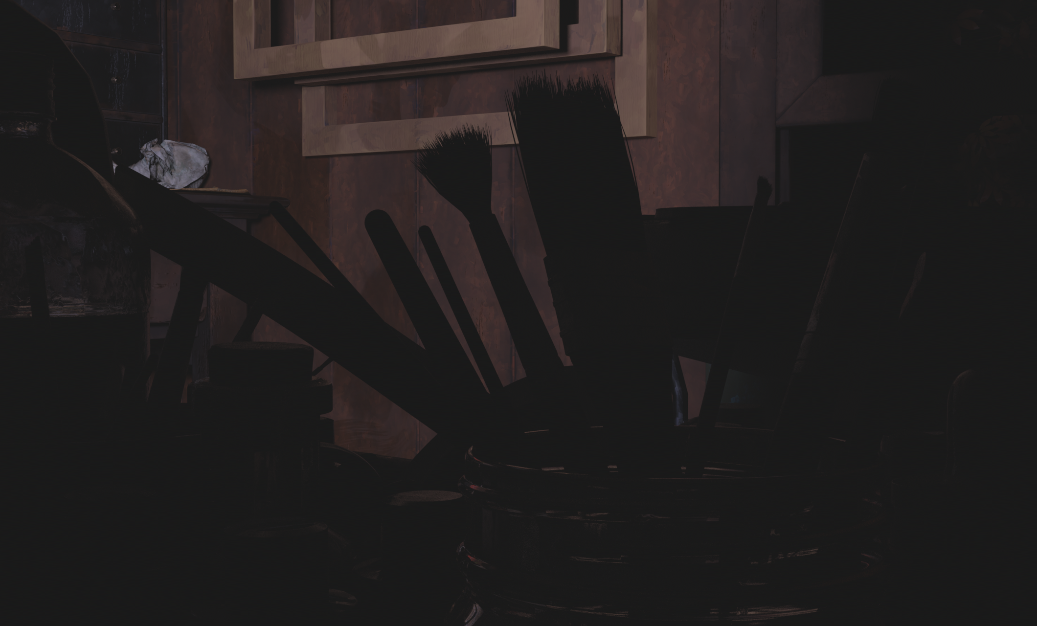
The brushes were the focus of this shot, so I wanted to make them stand out with the light coming through the window. I had to change the position of the sun from shot 1 so that it hit the brushes better and ended up having to brighten the background more than I was expecting in order to get the right about of bounce from the room.
Beauty
Sun Key
Brushes Key
Stool Key
Dome
Room Fill
Final Comp
Light Groups
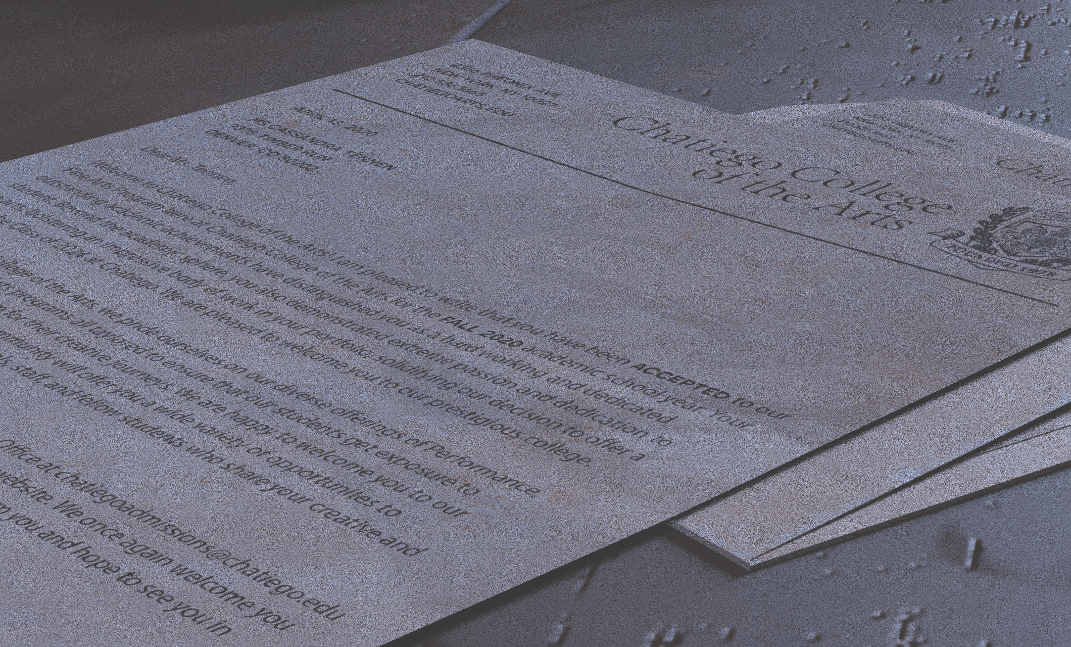
Outside of the depth of field that I would add in post, I wanted to use the lighting to also direct the eye towards the word "Accepted" on the letter. I added a spotlight on the word so that I could then mess with it's intensity and draw the eye.
Beauty
Letter Key
Letter Spot
Dome
Final Comp
Light Groups
This shot was relatively simple with a main key light illuminating the brush and canvas and supplementing that with a rim on the brush and general fill with the dome light. The room fill lightened up the areas that weren't getting hit by the other lights and helped to lighten the shadows behind easel.
Beauty
Sun Key
Brush Rim
Dome
Room Fill
Final Comp
.png)
Light Groups
This shot was a little difficult to work with because I wanted the sun to still be hitting the wall in some capacity while still respecting the location in the room. I opted for a softer light to imply the sun set and used a roto to cut off some of the light that was hitting objects higher in the frame. The cool fill was used to help hightlight the frames toward the end of the shot and act as more of a bounce from the room that I wasn't getting with the dome.
Beauty
Warm Fill
Cool Fill
Dome
Final Comp
Light Groups
I wanted to draw the eye to the closet and also begin shifting the time of day later than the beginning of the short. I used the light from the window to illuminate the closet and decided on a warmer temperature to imply a later time of day and used a fill light to make the paintings a little more visible.
This shot gave me the most problems render-wise. Because of how I had the lights set up, the dome and the closet key light were extremely noisy. To help with this I had to increase samples on the render as a short-term fix, though a more long-term fix would require replacing the lights entirely with lights that do not require as much sampling to render.
Beauty
Closet Key
Closet Fill
Dome
Final Comp
Light Groups
Similarly to shot 5, I wanted to imply the sun's light even though it realistically wouldn't be hitting the wall because of it's location relative to the window. I had set up a key to act as the sun but it was hitting all of the canvases evenly which was making the image look flatter and less dynamic than I intended. I dimmed the canvas key using a roto in Nuke and found that it gave the look I was going for. Once I figured this out I did the same to shot 5 and shot 3 as it gave more directionality to the light and made them less flat.
Beauty
Canvas Key
Room Fill
Final Comp
Light Groups
With the return to the brush in the canvas, it was important that the lighting felt different as to not repeat shot 4, this was one of the motivations behind changing the time of day. I wanted to push the lighting to be more dramatic, incorperating more of the shadows from the tree and adding harsher light rays in Nuke.
Beauty
Sun Key
Brush Rim
Window Key
Dome
Final Comp
Light Groups
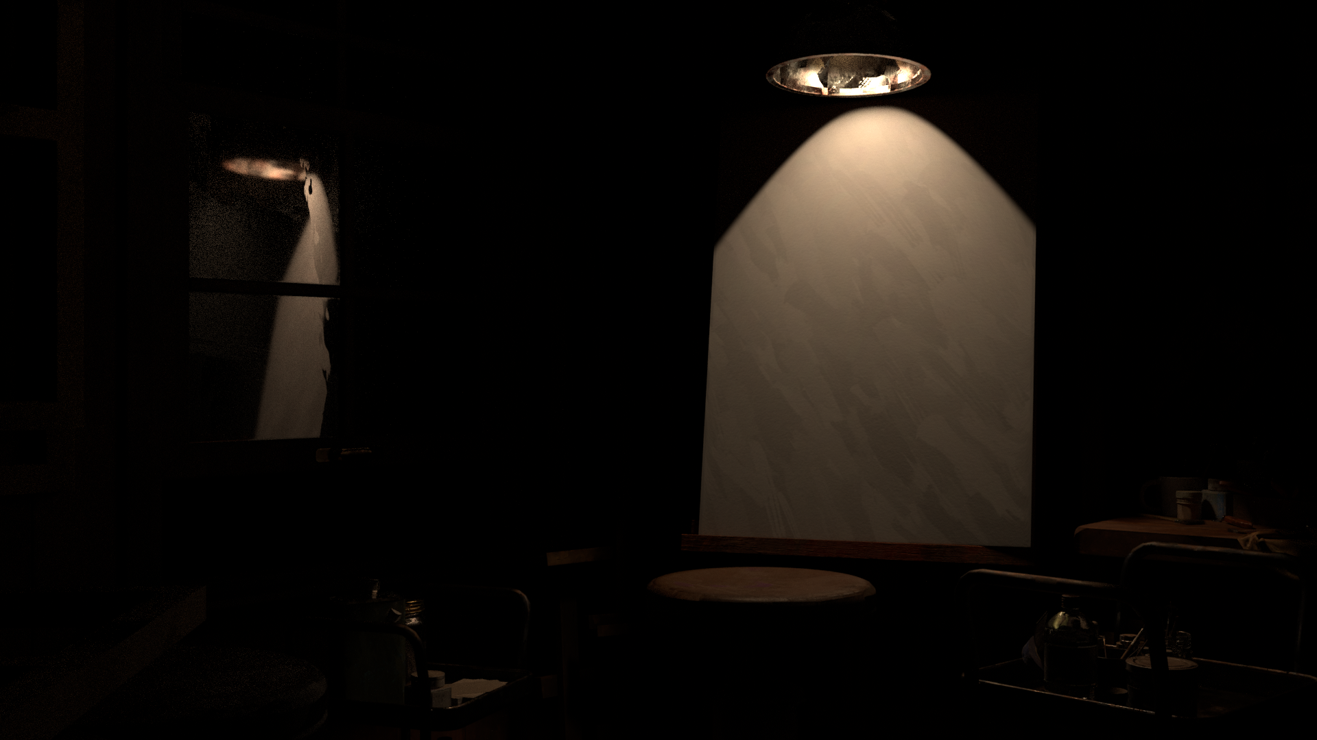
For the beginning of shot 9, I wanted to jump forward in time to twilight lighting. Again I wanted to exaggerate the colors a bit and pushed the purple of the sunset. I also wanted to draw the eye to the blank canvas to emphasize the change in room so I used the lamp on the easel to spotlight the canvas.
Beauty
Sun Key
Easel Spot
Dome
Final Comp
Light Groups
With the return to the brush in the canvas, it was important that the lighting felt different as to not repeat shot 4, this was one of the motivations behind changing the time of day. I wanted to push the lighting to be more dramatic, incorperating more of the shadows from the tree and adding harsher light rays in Nuke.
Beauty
Sun Key
Phone Rim
Phone Spot
Dome


I wanted to create a stylized look inspired by the work of Alberto Mielgo and the painterly style of Fortiche's work. My goal was to keep the stylization isolated to the color and normals so that they would interact with light realisically but have a painterly look to them.

My journey into the arts hasn’t been linear, and many of the roadblocks I faced early on were of my own making. I wanted to create something that could embody the most impactful part of my journey into the creative field, that being the overwhelming support that I received from my friends and family. They encouraged me to pursue a career in what I had always been drawn to but never followed, and I wanted to create a short that could encapsulate what that meant for me. I wanted to share some semblance of what that support felt like in a story, and I felt that Cassandra was the right character to do that with.
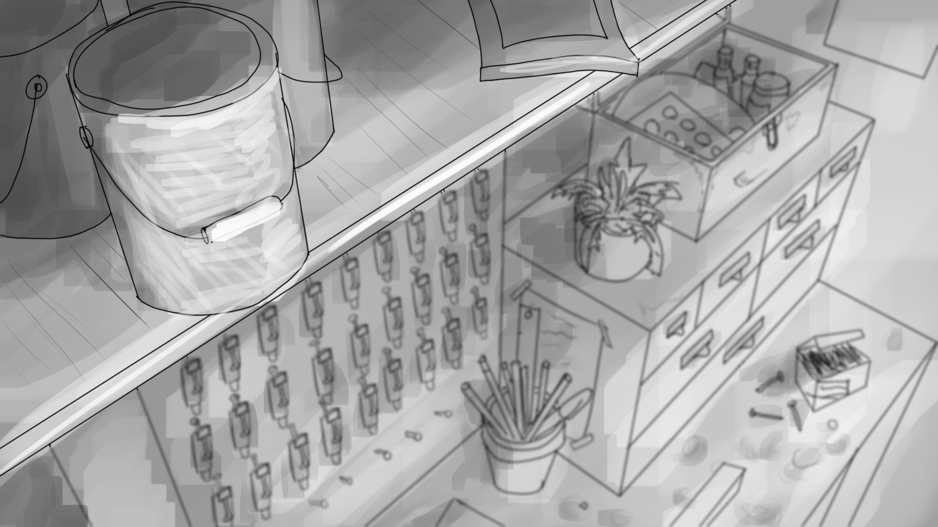
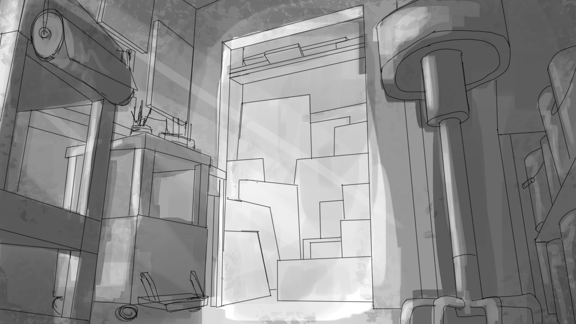
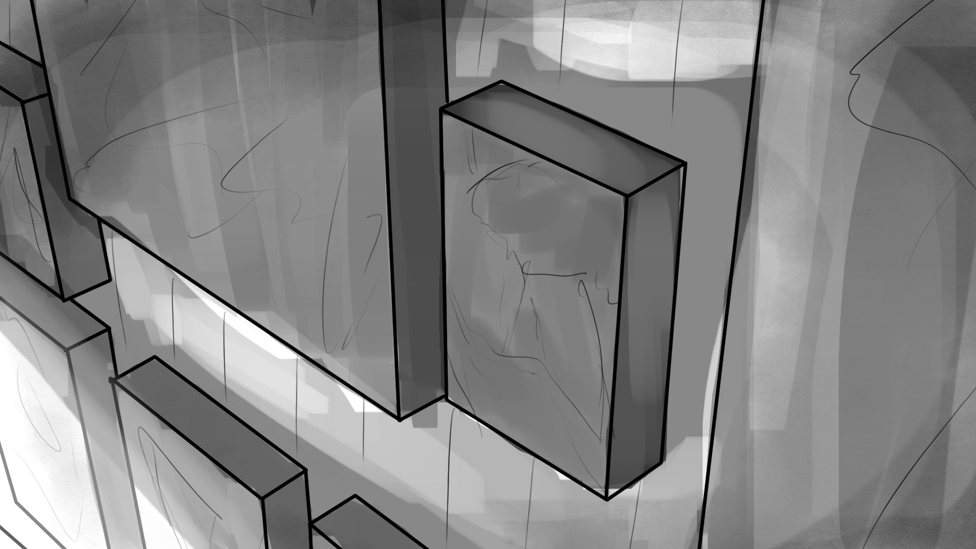
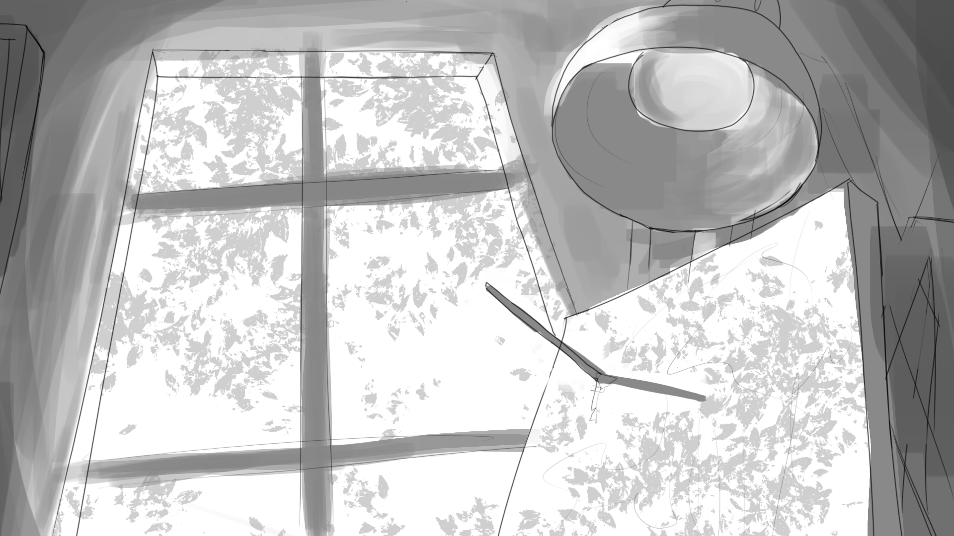
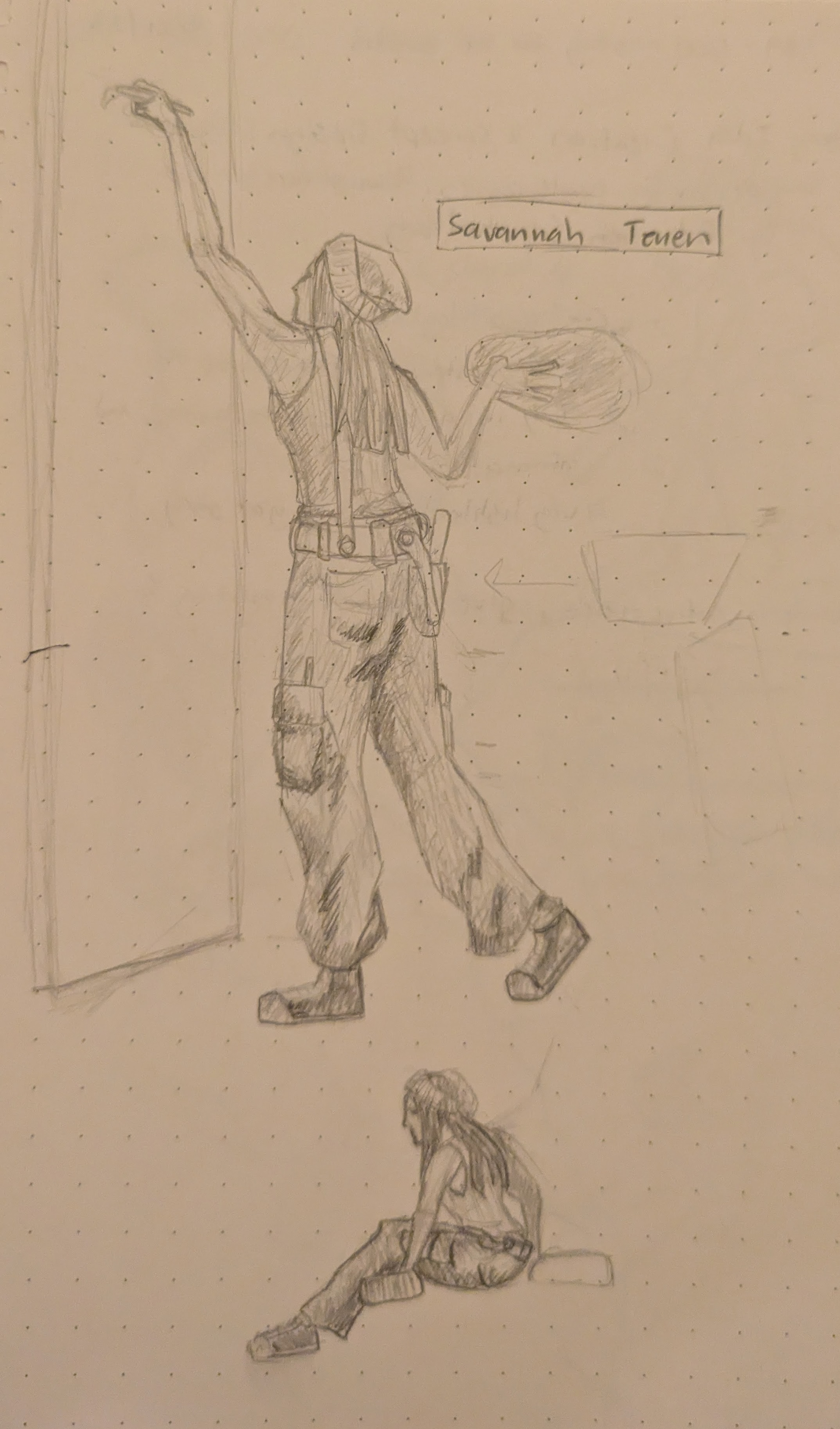
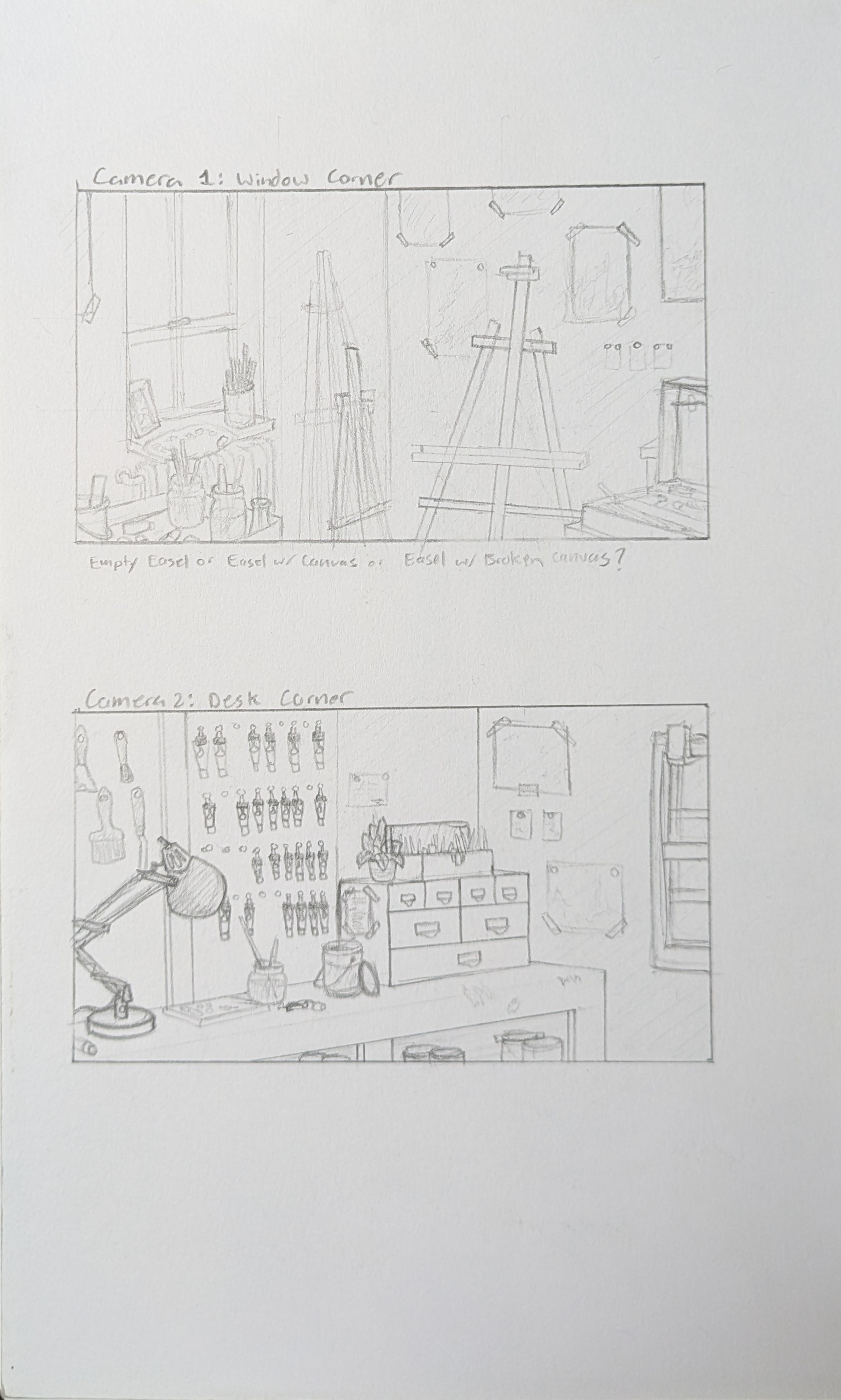
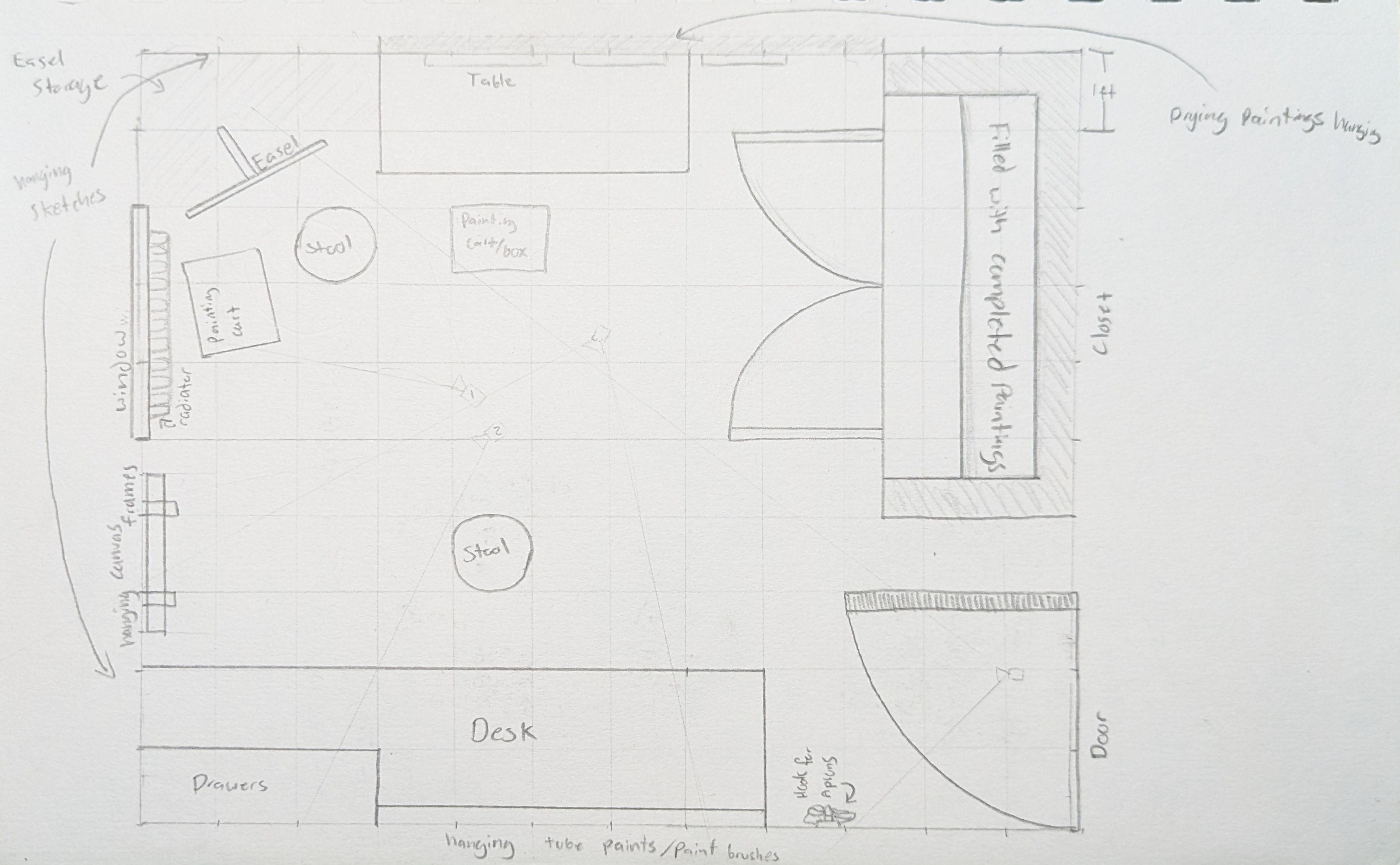
The images above are early iterations of camera layouts, character sketches, and visualizing Cassandra's (formerly Savannah) painting studio.
Paint is a 2 minute animated short created in Autodesk Maya, textured in Substance Painter, rendered using Renderman 26, composited in Nuke, and edited in DaVinci Resolve.
In the aftermath of an argument with her father, Cassandra receives a phone call from him, urging her to pursue her passions as the audience explores her painting studio.
I was responsible for most asects including the script, storyboards, look development, layout, lighting, compositing and editing of the short. I modeled the canvases and the walls while the rest was sourced from asset libraries such as Substance 3D, NVIDIA, CG Trader, and Polyhaven. Non-vocal tracks used in the final edit were sourced from Freesound and Pixabay while the pictures in the hanging frames in shot 5 were found on Pixabay.